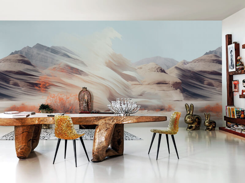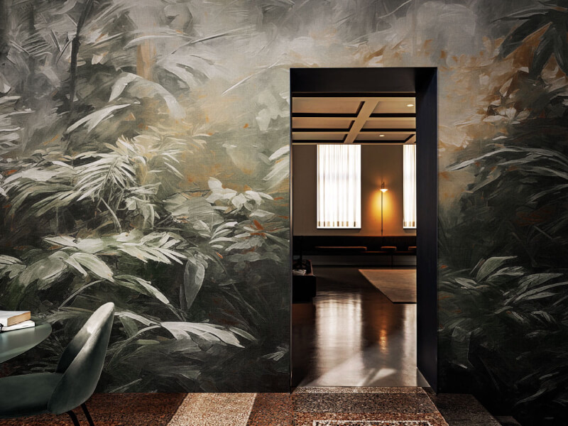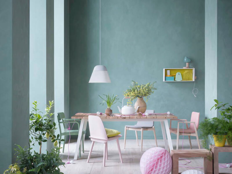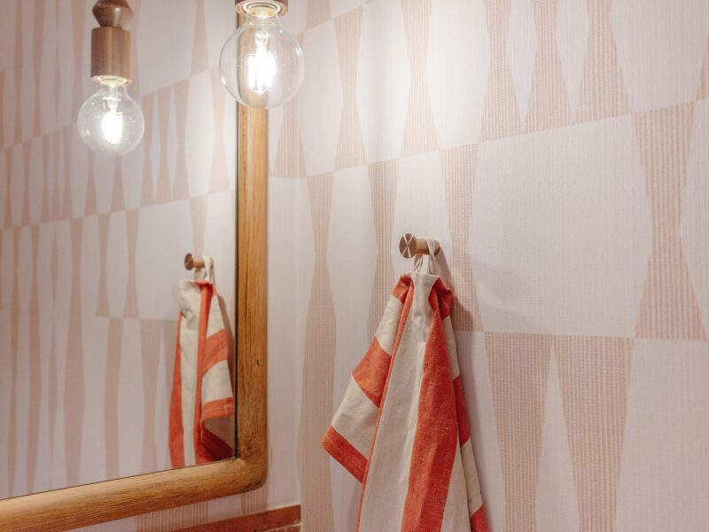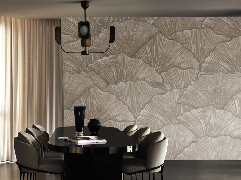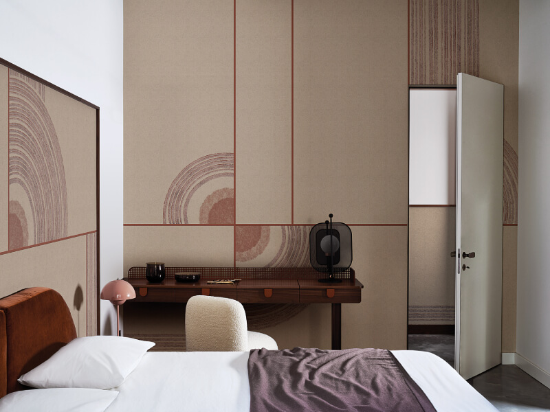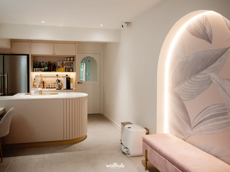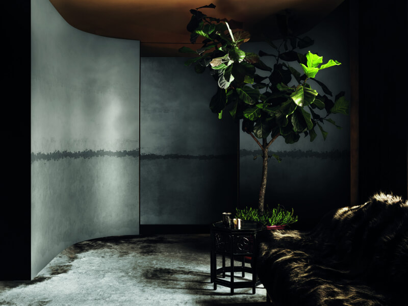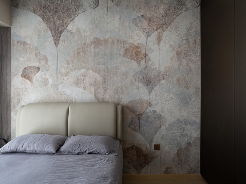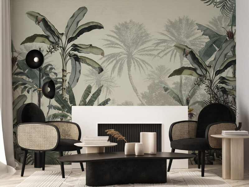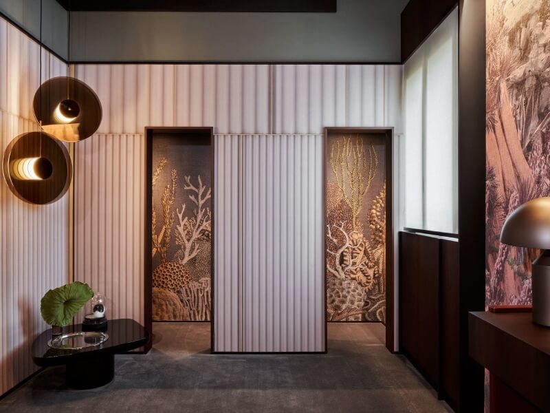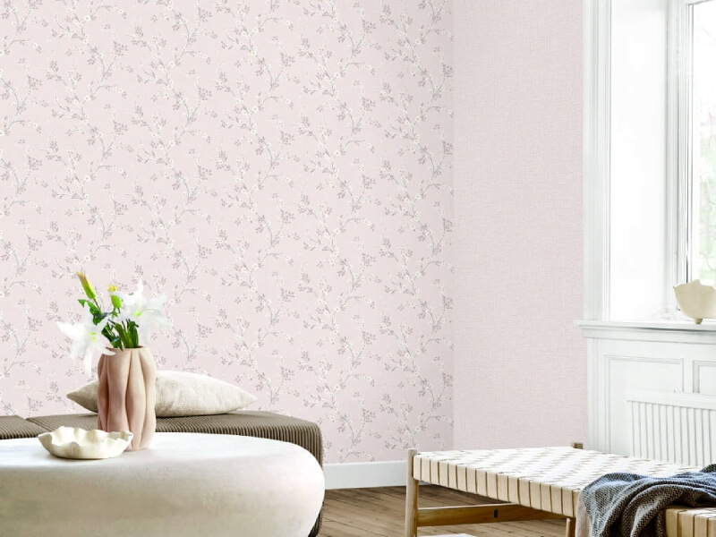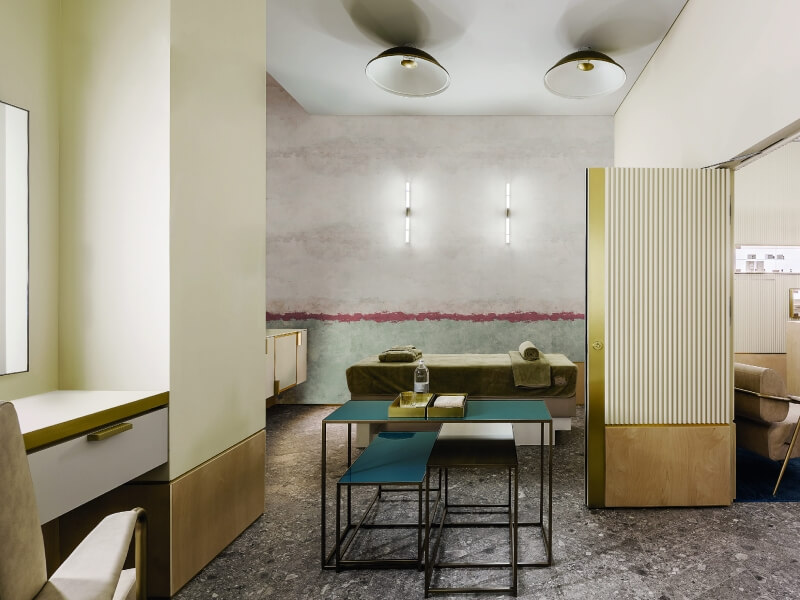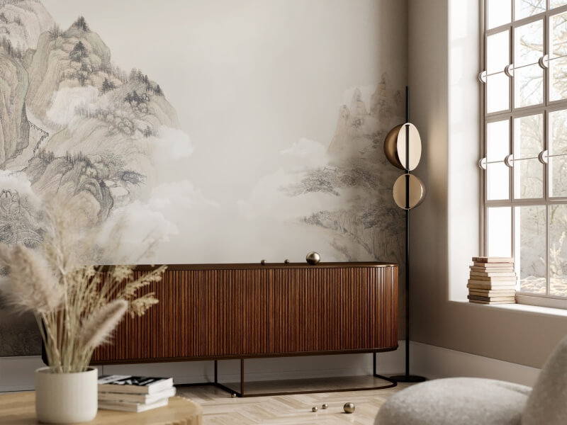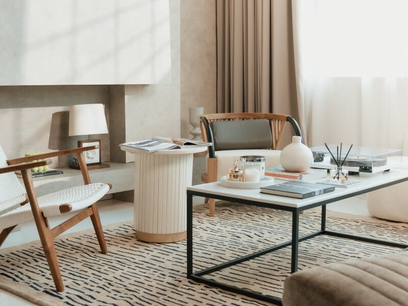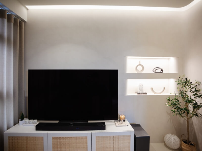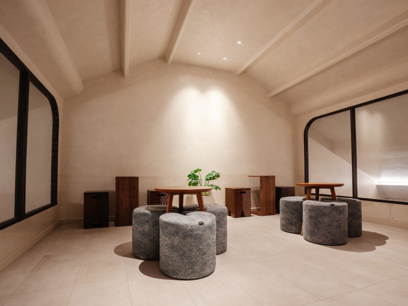
Painting a wall used to mean picking a colour and calling it a day. These days, homeowners in Singapore are asking for a lot more than that. Walk through any recently renovated HDB flat or condo and you might spot a wall with a soft, chalky glow, one that shimmers faintly under downlights, or one with visible brushstrokes that add depth without shouting for attention.
That shift is down to the growing popularity of textured and specialty paint finishes. They give a room character in a way flat colour simply cannot, and they are far more accessible than most people assume. If you have been scrolling through interior design pages wondering what all these finishes actually are and how they might suit your home, here is a straightforward breakdown of the main types of paint finishes to know.
Matte finishes: the quiet favourite
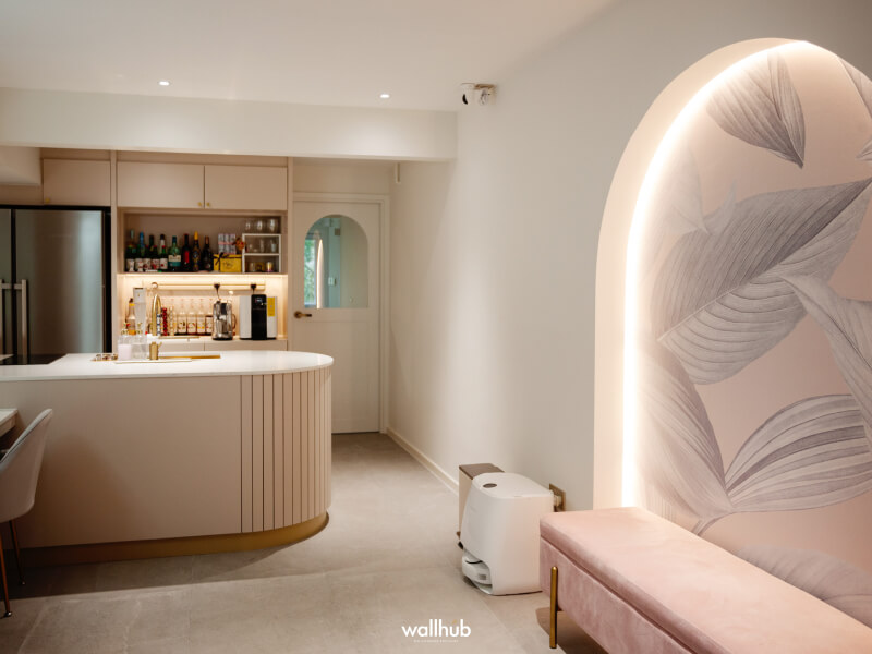
Matte remains the most requested option for a reason. It has a flat, non-reflective surface that hides minor wall imperfections instead of drawing attention to them, which makes it a practical pick for older units or walls that have seen a bit of wear.
Beyond the practical side, matte finishes give a room a calm, grounded feel. They work particularly well in bedrooms and living rooms where you want the colour to feel soft rather than sharp. The trade-off is that matte surfaces can be a little harder to wipe clean compared to glossier options, so they are usually better suited to lower-traffic areas.
Limewash: texture with history behind it
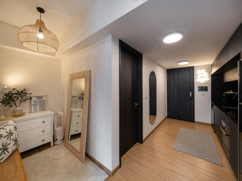
Limewash has had a real moment in Singapore homes over the past couple of years, and it is easy to see why. Made from crushed limestone, it produces a cloudy, mottled finish that looks almost like it has aged naturally over decades. No two walls ever turn out quite the same, which is part of the appeal for people who want something that feels handmade instead of mass-produced.
Getting the application right takes more care here than with standard paint. Some homeowners choose to layer limewash for a gradient effect, building depth in tone across a single wall. It suits Mediterranean, rustic and Wabi-sabi-inspired interiors especially well, softening a space in a way that flat paint struggles to replicate.
Because limewash is applied in thin, breathable layers, it also tends to age gracefully, developing subtle character over the years instead of looking flat and static the way conventional paint often does.
Metallic finishes: subtle shimmer, not sparkle
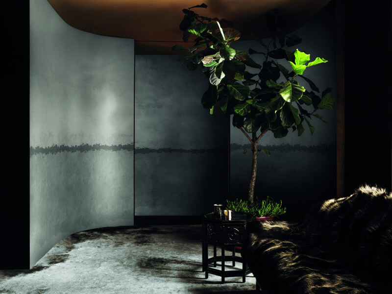
Metallic paint finishes tend to get misunderstood. People sometimes picture something closer to glitter or a disco ball, but a well-applied metallic finish is far more restrained than that. It uses fine mica particles suspended in the paint, which catch light at certain angles and create a soft shimmer rather than an obvious sheen.
Used on a single feature wall, metallic finishes can lift an entire room, especially in dining areas or hallways where the changing light throughout the day brings out different tones. Used across every wall in a space, the effect can quickly become overwhelming, so restraint tends to produce the best results.
Venetian plaster: the polished stone look
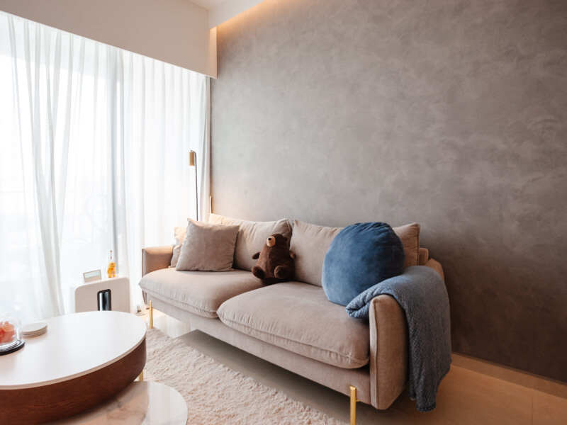
Venetian plaster is one of the more labour-intensive options on this list, but the payoff is a finish that genuinely looks like polished stone or marble. It is built up in thin layers and burnished by hand, giving it a depth and richness that paint alone cannot achieve.
This finish suits homes going for a luxe, minimalist aesthetic, and it holds up well in feature areas like accent walls, entryways or even bathroom vanities. Because of the skill and time involved, it does sit at a higher price point than standard paint finishes, but for a statement wall, many homeowners find it a worthwhile splurge.
It also ages well, developing a slight patina over time that only adds to its charm, which is one reason it remains a favourite among interior designers working on higher-end renovations.
Textured and sand finishes: added grip and depth
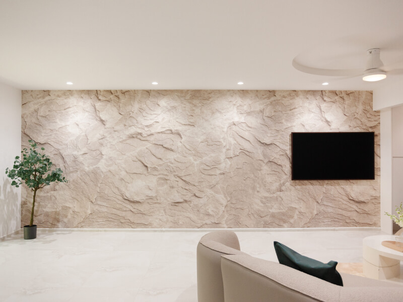
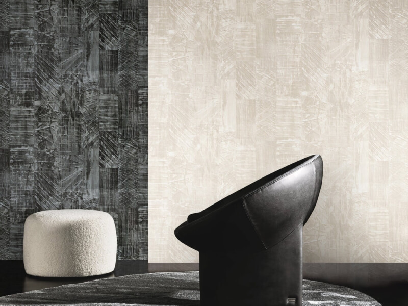
Textured finishes, sometimes called sand or stucco effects, add a physical grain to the wall surface. Instead of relying purely on colour or sheen, these finishes lean on touch and visual depth created by the paint’s actual texture.
They tend to work well in industrial or Scandinavian-inspired spaces, and they are surprisingly forgiving when it comes to disguising uneven plastering underneath. A few things to keep in mind before choosing one:
- Textured finishes can be harder to clean than smooth ones, so they suit accent walls better than kitchens
- They often need a slightly different application technique, so working with an experienced painter helps
- Lighting placement affects how the texture reads, so testing a sample patch under your actual room lighting first is a smart move
Choosing what fits your space
With so many paint finishes available, the right choice really comes down to how a room is used and the mood you are going for. A quiet bedroom might call for matte, a dining feature wall could benefit from a hint of metallic shimmer, and a living room going for old-world charm might lean towards limewash or Venetian plaster.
It also helps to think about upkeep. Families with young children or pets may want to keep textured or highly tactile finishes to lower-touch areas, saving the more delicate options for spaces that see less daily contact.
Sampling before committing is always a good idea too. Paint can look completely different once it is up on a full wall compared to a small swatch, especially with finishes that rely on how they catch light. Painting a test patch near a window and checking it again in the evening under artificial lighting gives a far more honest sense of how a finish will actually behave once the room is fully lived in.
Budget plays a role as well. Standard matte and satin options remain the most affordable across the board, while limewash, metallic and Venetian plaster sit higher up the price scale due to the skill and material cost involved. Setting a realistic budget early on makes it much easier to shortlist finishes without falling for something that looks stunning in photos but stretches too far beyond what a project can comfortably absorb.
Bringing it all together
Choosing between matte, metallic, limewash or plaster finishes does not need to feel overwhelming once you know what each one offers and where it shines. The best results usually come from matching the finish to the room’s function, the lighting it gets and the overall look you are building towards.
If you are still weighing up your options or want to see how these finishes actually look on a wall before deciding, get in touch with Wallhub.