Exposed brick has a hold on people that few finishes can match. It suggests warmth, age and a building with some history behind it, which is a tricky thing to conjure in a flat handed over three years ago with perfectly smooth plaster walls.
Wallpaper is the usual workaround, and it can be genuinely convincing or painfully fake depending on a handful of choices made at the sample stage. The difference between the two is smaller than most people expect.
Why Brick Reads Warm
Brick works in a living room because it introduces irregularity. Real brick varies in tone from one unit to the next, the mortar lines wander slightly, and the surface catches light unevenly. That visual noise is what makes a room feel lived in. Flat paint gives you a colour, while a considered brick wallpaper living room scheme gives you a surface with depth, and the difference becomes obvious the moment afternoon light rakes across it.
There is a practical bonus as well. A busy, variegated surface hides scuffs and marks far better than flat paint, which makes it a forgiving choice for a wall that sits behind a sofa or takes the occasional knock from a vacuum cleaner.
Getting The Tone Right For Local Light
The most common misstep is choosing a brick tone that fights Singapore’s light. Bright orange-red brick, the sort that looks handsome on an overcast London terrace, can turn strident under strong tropical sun and leave a living room feeling hot before anyone switches on a lamp.
Softer options travel much better. Whitewashed and limewashed brick, greyed-out industrial brick and pale sandy tones all hold their character through the middle of the day without dominating. Deeper charcoal brick can look superb in a room with limited direct sun, especially alongside warm lighting.
Think about the rest of the room too. Brick sits beautifully against timber, leather, rattan and plants. Against high-gloss lacquer and chrome it can look like a costume, so if your living room leans contemporary and polished, a subtler concrete or plaster effect may serve you better.
Scale Is What Gives The Illusion Away
Nothing breaks the effect faster than bricks printed at the wrong size. Check the printed brick dimensions against a real one before you commit, since most common formats sit around 215mm long and 65mm tall, and a design printed noticeably under that will read as slightly off even to someone who could not explain why.
Repeat is the other giveaway. A short repeat means you will start spotting the same chipped corner appearing every metre or so, and once seen it cannot be unseen. Look for designs with a long vertical repeat or a randomised layout, and always judge scale on a full-size sample held against the wall instead of on a screen.
Where To Put It
One wall is almost always the right answer in a living room. A few placements that consistently work:
- Behind the television, where brick visually absorbs cables and clutter
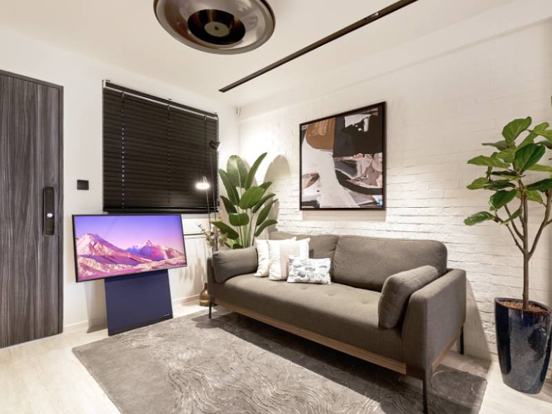
- Behind a sofa, as a backdrop with art layered over the top
- A dining nook inside an open-plan living area, to define the zone
- The wall around a feature shelf or a bar unit
- A balcony-facing interior wall, where the texture picks up side light beautifully
Wallpaper, Panel Or Paint?
Brick-effect wallpaper is the fastest and most forgiving of the three, and it comes off cleanly when you change your mind in five years. It is also the only option that gives you genuinely photographic detail at a sensible price, since the variation is printed from real brick.
If you want physical relief you can run a hand over, a texture paint finish applied by hand can build a plaster-over-brick effect with real depth. That is a bigger commitment and not something you undo in an afternoon, so it suits people who are certain about the look.
Brick slips and cladding panels make up the third route, and the most literal one, giving you genuine relief and real shadow. They cost more and eat a little floor depth, which makes them better suited to larger rooms where a centimetre or two off the wall line goes unnoticed.
Making It Look Deliberate
The rooms that pull this off share one habit: they treat the brick wall as a background and never as the main event. Furniture stays simple, the palette around it stays restrained, and the lighting does most of the work.
Wall-washing light from above, or a floor lamp angled across the surface, will exaggerate the texture and sell the effect completely. Flat overhead lighting does the opposite, flattening everything back into a printed image and undoing the whole exercise.
Layering helps as well. Using wallpaper to add dimension works best when the wall forms part of a wider scheme, with a rug, some timber and soft textiles all pulling in the same direction. One textured wall in an otherwise flat room can end up looking stranded.
Mind the edges while you are at it. A brick wall that stops dead at an outside corner gives the trick away instantly, so plan the surface to finish at a natural break: a door frame, a ceiling bulkhead, or a return into the next room.
A Wall With A Bit Of History
Faking age convincingly comes down to restraint. Pick a tone that suits your light, check the scale against something real, keep the surrounding room quiet, and light it properly. Do those four things and most visitors will walk up and touch the wall to check.
One last thing: order a little extra. Textured designs of this kind are unforgiving when it comes to patching, and a spare drop in the store cupboard saves a great deal of grief if a wall takes damage later on.
Our Singapore flagship gallery at Vertex on Ubi Ave 3 holds full-size samples you can carry over to a window and judge for yourself, which beats any screen. Drop in whenever suits you and our team will happily narrow the options down with you.