A Guide On How To Decorate Your Home With Pastel Wallpapers

A Guide On How To Decorate Your Home With Pastel Wallpapers

Pastel colours and wallpapers are popular choices of wallpaper in Singapore. Pastel colours are brighter shades of popular colours of neutral and calming tones. They are colours commonly used in many ways in the form of home decor.

When dealing with pastel-coloured wallpapers, it is essential to note what kind of decor would suit these neutral tones. Consider the ambience you want to bring out in your home using pastel wallpapers.

Read on to learn about how to decorate your home with pastel wallpapers.
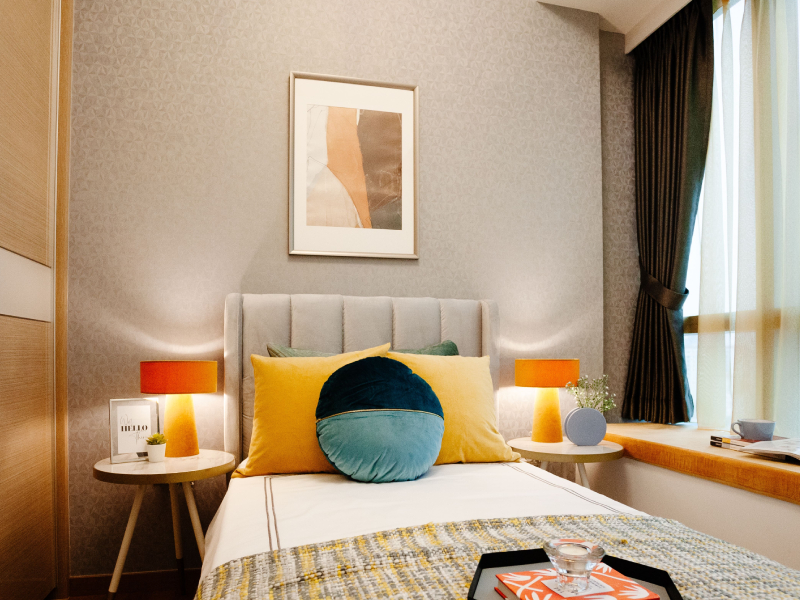
Matching tones

Matching tones

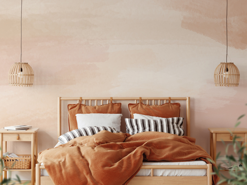
Pairing lighter pastel tones is one of the easiest ways to complete a simple yet classy look to your home. One of the best ways to make sure your pastel wallpapers stand out is by using wallpapers with tones of colour that match well with each other. For example, if you’re going for a more polished look, pairing greens and blues can help you to achieve a bohemian feel, giving your home a more elegant and stylish look. Decorating your room with fluffy white pillows and rugs can also help to enhance the bohemian feel of your home.
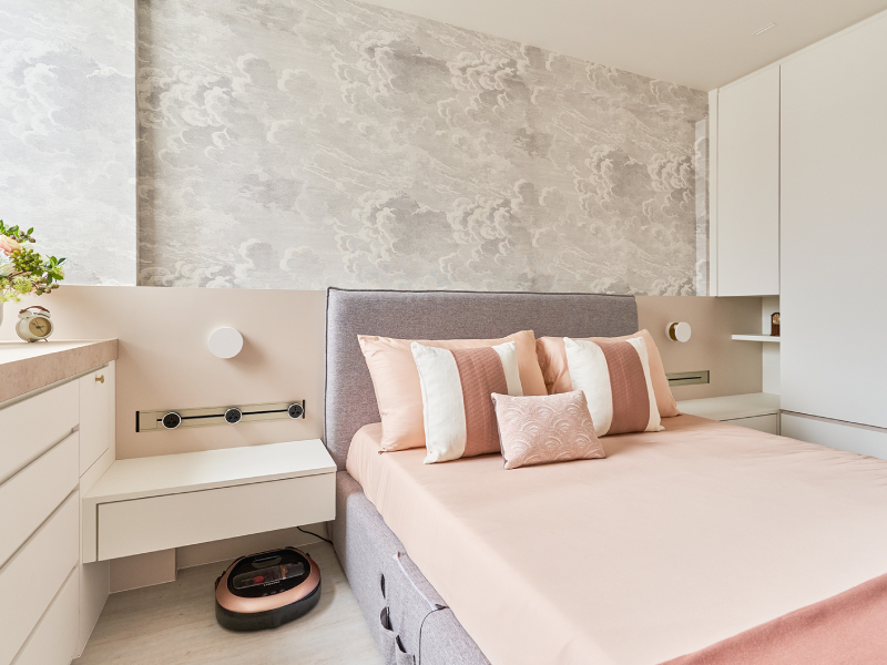
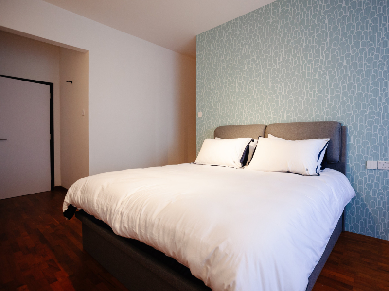
Minimalist grey

Minimalist grey

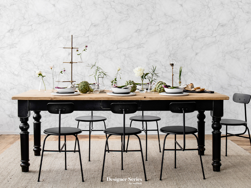
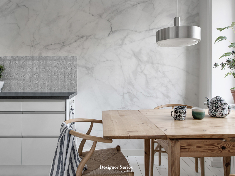
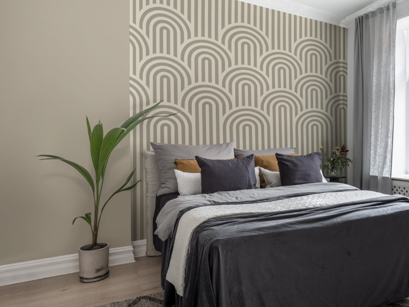
Some of us might prefer a more minimalistic style by only sticking with one colour to decorate our home. Grey pastel tones are the perfect way to achieve a simple yet sophisticated minimalistic style. Contrasting a grey-toned wallpaper design with white or wooden decor can help to give a little pop of colour to your home. Adding some greenery, such as succulents and big potted plants, can also help achieve a more vibrant look.

Colour blocking

Colour blocking

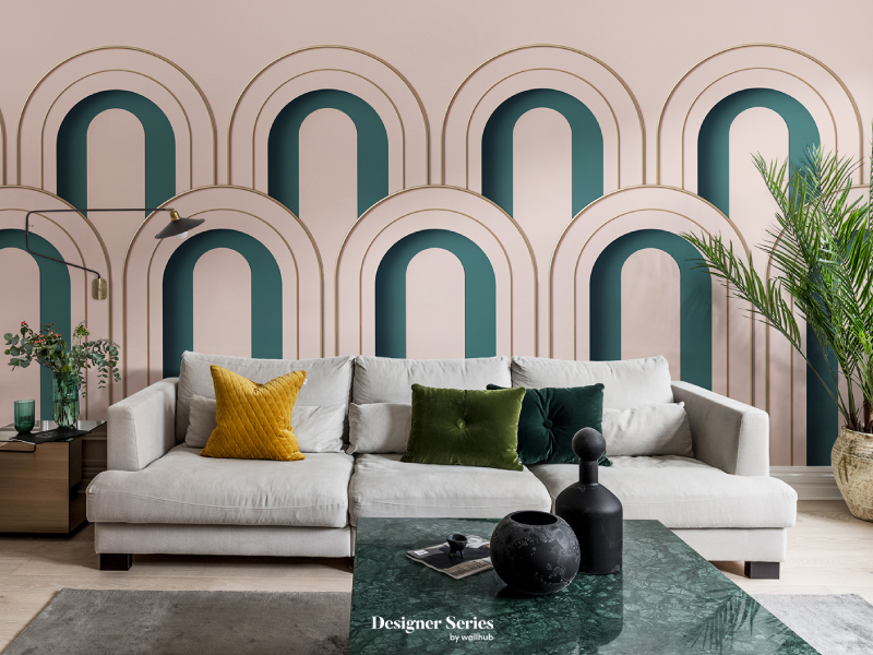
For those who are a bit bolder and more experimental, colour blocking is also a great way to utilise your pastel wallpapers. Colour blocking is an easy yet sure-fire way of giving your home a dynamic look that is neutral and not too overwhelming. Using colours on the opposite ends of the colour wheel creates a perfect contrast which helps your home to ooze personality and liveliness. Matching pink, yellow and green pastel hues together make the perfect complimentary look while adding a little bit of life to your home.

Touch of elegance

Touch of elegance

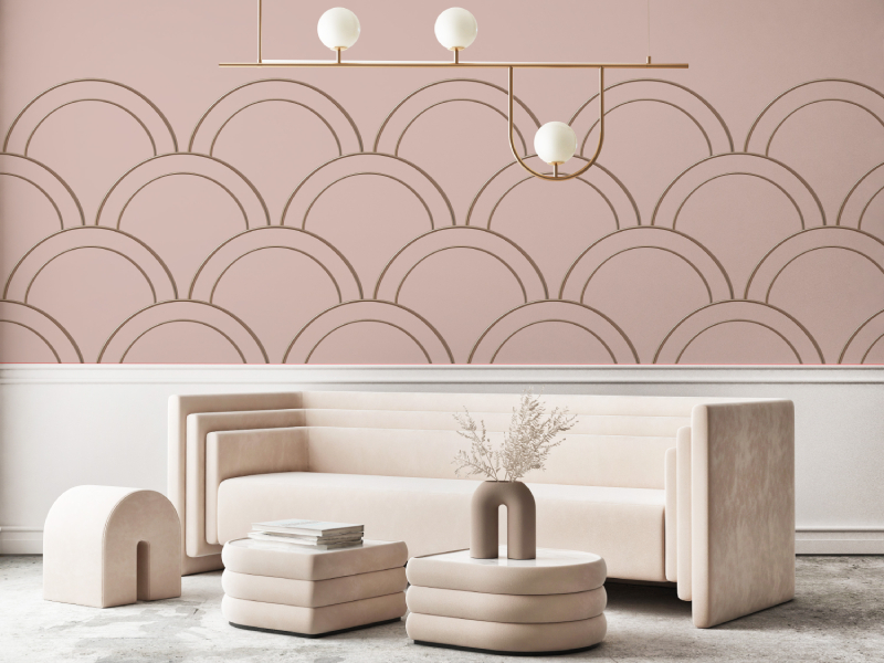
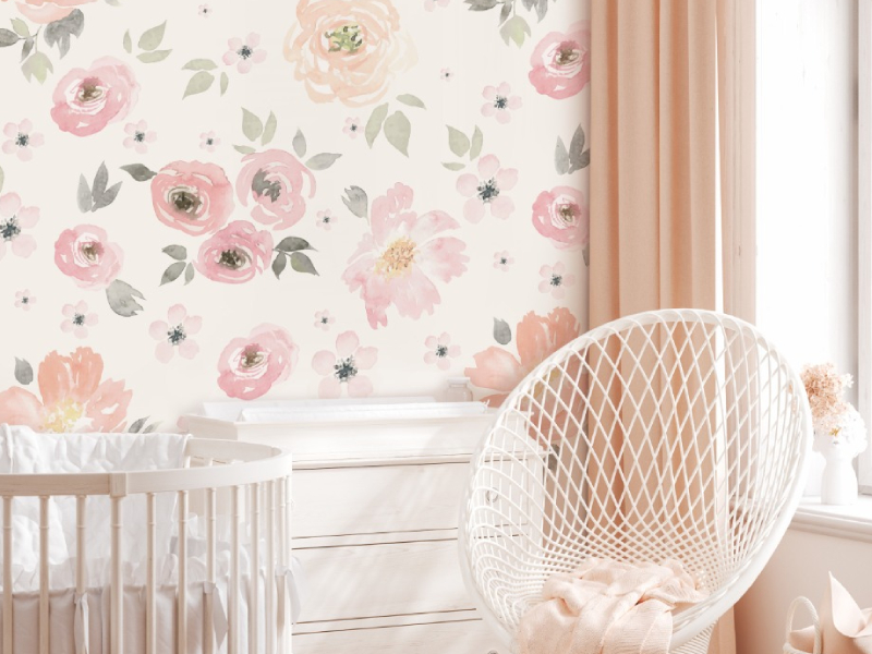
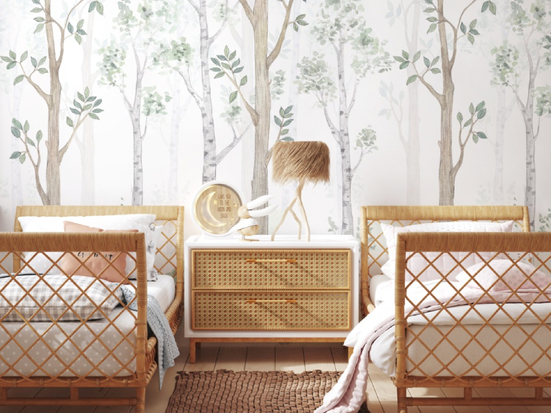
When most people think of pastel wallpapers, they think of nurseries and children’s rooms. However, pastel palettes are more versatile than you think. Why not give your home a little elegance by surrounding your pastel green wallpapers with gold and black furniture and decor to give a bolder look? Pairing your pastel pink wallpaper with rose gold decor and furniture can further help to establish a sophisticated ambience.

Conclusion

Although many might still have reservations about decorating their homes with such neutral tones, pastel wallpapers are the perfect design choice as long as you know how to complement them with your decor. Why not try something new? A simple change in your home decor could go a long way.

At Wallhub, we have the perfect array of pastel-toned wallpapers for you to choose from. Do not hesitate to contact us to browse our complete collection.

4 Impeccable Ways To Style Marble Wallpapers For Your Home

4 Impeccable Ways To Style Marble Wallpapers For Your Home

If you’re looking for an affordable way to make your home look more modern and luxurious, marble wallpapers are the perfect choice for home wallpaper in Singapore. Marble wallpapers can give off different ambiences depending on how you style them. Natural marble may be pricier, but marble wallpapers can give off the same effect without damaging your wallet.

Read on to learn how to use marble wallpaper to style your home.

1. Matching furniture

Matching Furniture

One of the best ways to style marble wallpaper is by ensuring it matches the furniture in your room. Colour matching can help create a harmonious look while enhancing your room’s overall theme and feel. For example, if your living room is decorated with blue and white furniture, a white marble wallpaper with hints of blue would be perfect for your living room. Additionally, the hints of colour lining the marble design could also be used as a guide to help you decide what colour furniture you should use to decorate your room.

2. Gold detailing

Gold detailing

Nothing matches more with a marble wallpaper design than gold detailing. It is well known that gold and marble go hand-in-hand with interior decoration. Whether a subtle hint of gold decoration around the room or striking gold furniture, the warm gold tones perfectly contrast the cool look of marble wallpaper. To further enhance the gold decor, matching gold furniture with marble designs that use gold lining is also the perfect way to pair your wallpaper with your furniture.

3. Sophistication at its finest

Sophistication at its finest

The elegant appearance of the marble wallpaper perfectly complements sophisticated decor. Simple decoration pieces, such as singular chairs and fluffy rugs, are more than enough to do the trick. Doing so would make your home give off the perfect ultra-modern look without spending too much on expensive pieces of furniture. You can also achieve a sophisticated look by choosing simple marble designs that highlight only two colours, giving off a more simple and elegant look for your humble abode.

4. Pastel paradise

Pastel paradise

If luxurious and high-end is not the vibe you’re going for, you can pair your marble wallpaper with pastel furniture and decor. The subtle and soft colours bring a fresh look to your home without overpowering the marble look. This look is ideal for young homeowners who want their homes to look stylish. It is also a lovely and chic design for a kid’s room or nursery, as the pastel colours give the room a youthful and bright appearance.

Conclusion

Use the tips mentioned above to make your home look luxurious and welcoming at the same time. There are many ways to accessorise marble wallpaper without making it look too overpowering compared to your furniture.

For the best wallpapers, flooring materials, blinds, and other collections to elevate home designs and home decor themes, do not hesitate to contact us at Wallhub. Arrange a showroom visit with us to browse our complete range of designs from around the world, including Japanese wallpaper in Singapore.

4 Tips To Take Note of When Matching Curtains With Wallpaper

4 Tips To Take Note of When Matching Curtains With Wallpaper

Homeowners often struggle to decide on the perfect curtain to frame their windows. Making decisions based on the look, feel, ambience and overall aesthetics, curtains help to complete the look of your entire room. The best wallpaper in Singapore will be more impactful when you have the perfect curtains.

Keep reading to find out what you should take note of when trying to match your curtains with your wallpaper.

Match the patterns

Match The Patterns

One of the most important factors to consider when picking out a curtain to match your wallpaper would be the pattern of the curtain. Simple and non-coloured sheer curtains would fit well with plain walls or blocked colours.

Geometric patterns, floral or repeated patterns on your curtains could also be a good match for your simple walls as it provides a pop of colour to your room. Wallpapers with patterns would be suitable with plain and simple curtains.

Take note of the contrasts

Take Note Of The Contrasts

Pairing your curtains with wallpaper does not necessarily mean the two have to match in terms of colour. It is vital to consider whether you prefer your curtains or your walls to stand out and base your decisions on that. Another good way of creating harmony between your curtains and wallpaper is by choosing contrasting colours. For instance, darker curtains would suit better if your walls are light, and vice versa. Curtains that are the opposite shade of your walls provide the ability to make your walls stand out even more.

Space is essential

Space Is Essential

Another thing to be extra careful of is that darker coloured curtains tend to make the space in our rooms look smaller. Although some prefer darker curtains to block the light, other options, such as light-coloured blackout curtains, could be used. Using lighter coloured blackout curtains can help to make a room look more spacious and bright without compromising the darkness of blackout curtains when the curtains are drawn. Dark blackout curtains mustn’t be used if your walls are dark, as this would create a gloomy atmosphere while also making the space in your room look limited.

Type of fabric and length

Type Of Fabric And Length

Whether your curtains are sheer or blackout curtains, it is essential to factor in the fabric of your curtains when trying to match them with your wallpaper design. The length of your curtains is also significant, as long patterned curtains could make a room look more stuffy than it is, especially when paired with a patterned wall. For more decorative and colourful walls, sheer and medium-length curtains would be recommended as the curtains would not overpower the walls, and the room will look brighter. One could also use blinds to adjust the length of your curtains according to what you feel is suitable.

Conclusion

Choosing the correct type of curtain to match your wallpaper can be tedious sometimes, but when you find the perfect pair, the results will be worth it. When choosing curtains, most people overlook space and brightness and only focus on design.

If you’re unsure, our qualified consultants and designers at Wallhub are always happy to assist. As the leading wallpaper shop in Singapore, we are dedicated to helping you find the best combination of wallpaper and curtains or blinds for your dream home.

5 Bedroom Wallpaper Inspirations For A Good Night’s Sleep

5 Bedroom Wallpaper Inspirations For A Good Night’s Sleep

Even if you adore vivid, statement-making patterns and colours, they might not be the greatest choice for bedroom wallpaper in Singapore. Tropical designs like bright yellows might not be ideal for creating the soothing sanctuary you want your bedroom to be, where you can unwind before drifting off for a pleasant night’s sleep. Instead, use soothing colours – blues, purples, and soft, neutral tones.

Consider what allows you to unwind and relax at night, like seeing the stars or listening to the ocean smashing on the beach. These components may help you design a tranquil ambience in your bedroom that will promote a pleasant night’s sleep.

Read on to learn about some of our favourite contemporary bedroom wallpaper ideas for designing your very own cosy haven.

1. Calming Blues

Calming Blues

One of our top suggestions for bedroom wallpaper is blue since it is regarded as the most tranquil colour. There is something to suit every inclination, ranging from delicate pastel blues to deep navy. Different tones of blue may create a calming atmosphere in your bedroom.

2. Bringing the outdoors in

Bringing the outdoors in

Being outside in vast spaces, whether it’s a deserted beach or up in the hills, can help to calm our minds. Many outdoors elements, like the skies and seas, can also invoke a sense of peace and tranquillity. You may achieve the same calming ambience in your bedroom by framing images of your favourite places you’ve visited while on your adventures or by using a sky-inspired wallpaper design.

3. Drift off with the clouds

Drift off with the clouds

A cloud-patterned wallpaper in Singapore might be a good option if you’re searching for an off-white wall colour to give your room a feeling of spaciousness. It can provide the appearance of space in tight spaces, and it’s a terrific method to bounce light around in dark, secluded spaces without access to huge windows.

4. Soothing Purples

Soothing Purples

Purple is one of the most elegant and noble hues and is sometimes referred to as the colour of royalty. Darker hues and tints evoke awe and richness, unlike any other colours. Lighter purple shades and tones tend to be more fun and upbeat. It is a lovely hue for a kid’s room or nursery because it is not associated with a specific gender. Additionally, it works well in areas where you spend a lot of time.

5. Sleeping in field of flowers

Sleeping in field of flowers

You might have dreamed about drifting off to sleep in a field of roses or sunflowers as a child. Why not make that come true (somewhat) with floral wallpaper designs?

One of the most popular wallpaper patterns in bedrooms is opulent rose patterns which can evoke the mood of a genuine boudoir or a refined setting. Flowers have a rich, magical atmosphere that oozes richness and elegance when set on a black backdrop. Meadow flowers are also a fantastic way to give a touch of natural freshness to a space.

Conclusion

The bedroom is a space you spend the most time in, which is why the aesthetic and overall vibe of the room should not be neglected or underestimated. A simple wallpaper revamp might completely change the atmosphere of your bedroom.

For more design inspirations, do not hesitate to contact us at Wallhub or arrange a visit to our showroom to browse our complete collection of exclusive designs from around the world, including Japanese wallpaper in Singapore.