Textured Coating For Exterior Walls In Tropical Rain

Textured Coating For Exterior Walls In Tropical Rain

Walk past any older landed property after a long wet spell and you can usually read its history off the front wall: streaks below the window sills, a greenish tinge on the shaded side, a patch where someone touched up the paint and never quite matched it. Exterior surfaces here take a beating that interior walls never see.

That is the context for choosing a textured coating for exterior walls instead of ordinary masonry paint. A textured system adds physical depth to a facade, and the better formulations are built to tolerate the movement of the substrate instead of cracking the first time the wall expands in the afternoon heat.

What The Climate Actually Does To A Facade

Singapore records a long-term mean annual rainfall of 2,113.3mm across roughly 171 rain days, with humidity sitting high all year round. Walls are wet, then baked, then wet again, often within the same day.

That cycle drives two problems. Repeated wetting and drying works away at hairline cracks until water finds a route behind the finish, and persistent surface moisture in shaded spots gives algae and mould somewhere comfortable to settle.

A flat paint film shows both of these clearly, since any variation in colour or sheen stands out across a smooth surface. A textured finish breaks up the light and disguises minor variation, which is part of why it tends to age more gracefully on a tropical facade.

Where Textured Coatings Earn Their Place

Wallhub’s textured coating range runs in two directions. Takumi Coating takes a wabi-sabi approach with organic textures and earthy pigments across nine options, including Archi, Basalt, Canyon, Oro, Popcorn, Urban, Voyage, Wabi and Zen, and is formulated to be crack-resistant and durable over time. Minerals Coating works from granite chips and mineral blends to produce a natural stone effect, available as Mineral Fine, Mineral Rock and Mineral Flakes, with low VOC and formaldehyde-free credentials.

Both systems are specified for indoor and facade applications and are engineered for Singapore and Malaysia’s climate. Application is handled by trained in-house craftsmen, which influences the result more than most people expect, since keeping a texture consistent across a large elevation is largely a question of technique.

Colour behaves differently on a textured facade too. Pigment settles into the low points and catches the light on the raised ones, so a single shade reads as a range of tones across the day. That variation is flattering on a large elevation, where a flat colour can end up looking slightly like a computer rendering.

Scale is a factor when choosing between the two ranges. A fine mineral finish keeps a modern facade crisp and reads as a solid surface from the street, while a coarser organic texture suits older architecture and boundary walls, where a handmade quality is part of the appeal.

Texture Choice Is A Maintenance Decision

Deeper textures hide imperfection beautifully and hold onto dirt a little more willingly. Finer textures stay cleaner but reveal substrate movement sooner. Neither is universally the right answer, and the honest way to choose is to think about how the wall will be cleaned, and how often anyone will realistically get round to doing it.

Orientation feeds into this as well. A shaded elevation that never dries fully benefits from a finish that sheds water quickly, while a sun-exposed wall is more concerned with colour stability over the years. Walking the property at two different times of day before choosing is a small effort that prevents a great deal of regret.

Comparing the character of different decorative systems helps too, and the distinctions drawn in limewash vs venetian plaster carry over usefully when you are weighing a mineral texture against a smoother trowelled one.

Preparation Decides The Lifespan

Whatever finish goes on top, the substrate underneath sets the clock. A sensible sequence before any coating is applied looks something like this:

  • Wash down the wall and let it dry fully, since trapped moisture undermines adhesion
  • Remove loose or flaking material back to a sound surface
  • Trace cracks before filling them, because a crack that keeps reopening is telling you something about movement behind the wall
  • Check and repair sealant around window frames, copings and render joints
  • Clear blocked gutters and downpipes that have been feeding water onto the elevation

Skipping the water ingress checks is the most common false economy. A blocked gutter or a failed frame seal will defeat even an excellent coating, usually within a year or two of application, and the repair then costs more than the original preparation would have.

For Larger Buildings

Owners of larger properties have an additional consideration. Under the Building and Construction Authority’s Periodic Facade Inspection regime, buildings more than 20 years old must be inspected every seven years by an appointed competent person, with any defects repaired.

A recoating exercise is often a sensible moment to address findings from an inspection, since access equipment is already in place and the cost of scaffolding or gondola hire is being spent anyway.

Commercial and hospitality owners also tend to care about downtime. Coordinating the schedule around quieter trading periods, and understanding how long each elevation needs to cure before it can take rain, keeps disruption manageable.

Getting The Right Finish On Your Walls

Choosing a facade finish is a long-term decision, and the useful conversations happen in front of physical samples instead of on a screen. Texture, colour depth and the way a surface handles water are all far easier to judge with the material in your hands.

Wallhub offers complimentary samples and consultation, and our team can look at your property’s orientation, condition and exposure before recommending a system. Talk to us at the showroom or through the contact page, and we will help you find a finish that still looks good several monsoons from now.
Texture Paint For Bedroom Walls: Calm, Tactile Ideas

Texture Paint For Bedroom Walls: Calm, Tactile Ideas

Bedrooms get the least design attention of any room in the house, which is odd given they are the first thing you see every morning. Guests never go in, so the walls stay whatever shade the previous owner left behind, and the room ends up feeling like a corridor with a bed in it.

Texture is the quickest way to change that without repainting the whole flat. A tactile finish catches light across the day, softens hard edges and gives a plain room some depth. Choosing texture paint for bedroom walls also sidesteps the pattern commitment that puts some people off wallpaper entirely.

Why Texture Reads Differently In A Bedroom

Bedroom lighting is unlike anywhere else in the home. Morning light comes in low and direct, afternoons are often shuttered against the heat, and evenings run on warm bedside lamps. A flat emulsion looks much the same under all three.

A textured surface changes character with each one, picking up shadow in the morning and settling into something softer at night. That shifting quality is precisely why these finishes suit the room where you spend the most hours, since the wall never quite looks the same twice.

The effect is also gentler than pattern. A feature wall behind the headboard gains presence without demanding attention the way a bold print would, which helps in a room whose main job is to help you switch off.

Finishes That Stay Calm

Not every texture belongs in a bedroom. Heavy stone effects and pronounced trowelled patterns look excellent in a hotel lobby and slightly aggressive behind a pillow. Softer, cloudier applications tend to work better here, where you are looking at the wall from a metre away while half asleep.

Terra texture paint covers this ground across several series, including Organic and Crème for gentle, mineral-looking surfaces, plus Metallic and Geometric options when you want more presence. Over 100 colours run across the Organic, Crème, Éclat, Glamour and Mellow codes, applied as a single tone, a multi-tone blend, or with geometric groove lines for a more architectural effect. Novacolor from Italy sits alongside these for specialised decorative work.

Scale is part of the calculation. A fine, sandy texture reads as almost plain from across the room and only reveals itself up close, which suits a compact bedroom where a heavier finish would feel closed in. Larger, more sculptural textures need distance to be appreciated, so they sit better in a generous master bedroom with space at the foot of the bed.

Sheen is the other lever. A matte surface absorbs light and keeps the room soft, while anything with a subtle sheen picks up the glow from bedside lamps and lifts a darker colour. Bedrooms generally do better at the matte end, with any shine saved for a small detail instead of a whole wall.

Colour Pairings That Work Behind A Bed

Muted and slightly warm tends to beat cool and crisp in a bedroom. Soft clay, oatmeal, warm greige and dusty terracotta all flatter skin tones under lamplight and avoid the faintly clinical feel that pure greys can bring after dark.

Deeper shades are not off limits either. A muted olive or a soft charcoal behind the headboard can make a bedroom feel enclosed and restful, provided the rest of the room stays light. The trick is keeping the ceiling and the opposite walls pale, so the darker surface reads as deliberate depth instead of a shrinking room.

Undertone consistency across the room does most of the heavy lifting. Once you know how a shade behaves in your particular light, everything else gets easier, and the principles set out in limewash colours for Singapore’s natural light apply just as neatly to a textured finish.

Practical Points Before You Commit

A few things are useful to settle in advance:

  • Texture holds dust slightly more than flat paint, so a gentle wipe or a soft brush attachment every few months keeps it looking fresh
  • Deeper textures are harder to touch up invisibly, which is a real consideration in a rented flat
  • Terra products are water-based, low odour and free from formaldehyde and lead, which helps if you will be sleeping in the room soon after application
  • The finish is crack-resistant, though walls with existing structural cracks still need those addressed first
  • One feature wall plus three plain walls is often more effective, and cheaper, than texturing the entire room

Working With What The Room Already Has

Bedrooms come with fixed elements you cannot change: a built-in wardrobe in a particular laminate, a timber floor, a window with a specific outlook. Texture works best when it responds to those instead of competing with them. A warm oatmeal finish next to light oak joinery feels considered, while a cool grey against the same wood can read as an accident.

Application method changes the result as much as the colour does. Sponge work produces a mottled, cloud-like surface, a soft brush leaves directional movement, and spray application gives the most uniform grain. Seeing samples prepared all three ways is far more useful than choosing from a colour chip, because the same shade can look like two different products depending on how it goes on.

Making A Start

A bedroom refresh does not need to become a full renovation. One wall, the right finish and a colour that suits your light can change how the room feels to wake up in, and most of the work happens within a day or two.

Think about headboard height while you plan, since a good portion of any feature wall sits hidden behind the bed. Carrying the finish higher up the wall, or across the full width including the bedside tables, keeps the effect from looking like a rectangle that stops abruptly.

If you would like to see and touch the finishes before deciding, Wallhub’s gallery has samples applied across a range of techniques, and our team can advise on what suits your lighting and your existing furniture. Come by the showroom or get in touch, and we will help you find something your bedroom actually deserves.

Fluted Panel Feature Wall Ideas Beyond The TV Console

Fluted Panel Feature Wall Ideas Beyond The TV Console

Somewhere around 2021, every renovation feed in the region decided that a television needed vertical timber slats behind it. The look became so common that it now reads as a default setting, which is a shame, because the material is capable of far more interesting work elsewhere in a home.

A fluted panel feature wall brings rhythm and shadow to a surface without adding pattern or colour, which makes it unusually flexible. Here are the places it tends to be underused.

Hallways And Entry Corridors

Corridors are the most neglected surface in most homes, and also among the easiest to transform. Vertical fluting draws the eye along a narrow space and makes a low ceiling feel taller, while the repeating shadow lines give a blank passage something to look at on the way past.

Because a hallway is walked through instead of sat in, you can be bolder here than in a living room. A darker walnut tone that would swallow the light in a small bedroom becomes genuinely dramatic in a corridor, particularly with a wall light washing down across the grooves.

Durability is the practical benefit. Wallhub’s Classic and Contemporary panels are built from New Zealand solid pine wood with a German vinyl film coating, and are stain resistant and easy to maintain, which suits a surface that gets brushed past with bags and shoes several times a day.

Behind The Bed

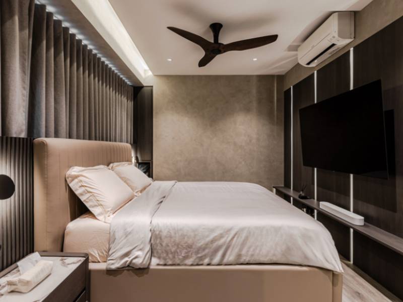
A panelled headboard wall gives a bedroom the built-in look of a hotel suite without the joinery bill. Running panels floor to ceiling across the full width of the bed, then mounting reading lights directly onto the surface, reads as a deliberate design decision instead of an afterthought.

Warm timber tones sit comfortably alongside the pared-back Japanese influence many homeowners are drawn to, and the material palette described in the Japanese Wallpaper Guide pairs naturally with fluting on an adjacent wall.

Dining Nooks And Banquette Seating

Dining areas in local flats are often a leftover space between the kitchen and the living room, defined by nothing more than where the table happens to sit. Panelling one wall gives the zone an edge and makes a built-in bench look intentional instead of improvised.

Half-height panelling works particularly well here, with the fluting stopping at around a metre and a painted or papered surface above. That keeps the area from feeling heavy, and it protects the part of the wall most likely to be scuffed by chair backs.

Moisture resistance is a genuine advantage this close to a kitchen. The panels resist moisture, pollutants, bacteria and fungus, so splashes and cooking humidity are much less of a concern than with untreated timber.

Over 30 colourways and designs are available, which gives room to match existing joinery instead of settling for the nearest approximation and hoping nobody notices.

Home Offices And Video Call Backdrops

Hybrid working has made a lot of people conscious of what sits behind them on screen, and a fluted surface happens to photograph well under a webcam. The vertical lines give depth without the visual noise of a crowded bookshelf.

Acoustics are the stronger argument though. The Aco.Wood range combines engineered wood slats and thick natural wood veneer with a polyester fibre acoustic felt backing, which absorbs sound instead of bouncing it around a hard-surfaced room. Anyone who has taken a long call in a tiled study will recognise the difference immediately.

Fitting And Finishing Details

Panels join using snap panel technology, which keeps the seams between sections consistent and produces a cleaner line than butting boards together by hand. Edges, external corners and the junction with the ceiling are where an installation gets judged, so trims and end pieces deserve as much thought as the panel colour.

Plan around your switches, sockets and any wall-mounted brackets before ordering, since cutting around them cleanly is a matter of setting out at the start. Our in-house installation team handles this as part of the job, which avoids the common problem of a handsome panel run interrupted by an awkwardly placed socket.

  • Confirm the panel direction before ordering, since horizontal runs need different backing support
  • Decide where the run stops, because a panel that dies into a corner looks different from one that turns it
  • Check skirting and cornice profiles, which may need trimming or removing for a flush finish
  • Allow for the panel depth when planning door swings and furniture placement
  • Order a spare length or two, so a future repair matches the original batch

Lighting deserves a moment too. A downward wash from a recessed strip exaggerates the shadow lines, while flat front-on lighting cancels much of the effect, so the position of your existing fittings can change how strong the texture looks once everything is up.

Bringing The Idea Into Your Own Space

The material has been typecast by a few years of very similar renovation photos, but the format suits almost any wall that could use structure without pattern. A corridor, a headboard, a dining nook or a study all benefit from the same rhythm that made the look popular in the first place.

Budget tends to follow the area covered instead of the room it sits in, so a modest corridor can cost less than people expect while a full-height living room wall costs more. Measuring the actual surface before you settle on a finish saves a slightly deflating conversation later on.

Mixing the format with other materials works well too. A panelled section beside a plain painted return, or next to a textured finish, gives a room two kinds of surface interest without either one competing with the other.

Come and see the profiles and colourways in person at the Wallhub gallery, where you can compare finishes side by side and work out what suits your space. Our team is glad to help you plan the layout, and to make sure the result looks like it was always part of the home.

Cloud Dancer White Walls: Styling 2026’s Softest White

Cloud Dancer White Walls: Styling 2026's Softest White

White walls have spent a decade being quietly dismissed as the safe option, the thing you leave in place because you cannot decide. Then Pantone named Cloud Dancer its Colour of the Year for 2026, a soft and slightly airy white, and the safest choice in the house became the one everybody wants to talk about.

The catch is that a soft white only works when something else in the room is doing the heavy lifting. Without texture, a white wall reads as unfinished. With it, the same wall becomes the calmest surface in the home. Getting there usually means thinking about wall texture paint and surface treatment before thinking about the colour itself.

Why Flat White Falls Short In Local Light

Bright equatorial light is unforgiving on plain surfaces. A flat white wall under strong midday sun bounces light back evenly and loses all definition, which is why so many freshly painted flats feel slightly clinical before the furniture arrives.

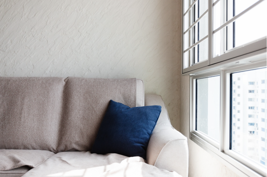
Texture solves this by introducing micro-shadow. A gently mottled or brushed surface holds variation across its face, so the wall still has depth at noon and warmth by lamplight. The colour stays white; the surface simply stops behaving like a blank sheet of paper.

The same principle explains why hotel lobbies and gallery spaces get away with almost entirely white schemes. There is nearly always a plaster, a stone or a fabric surface somewhere in the room supplying the depth that paint alone cannot.

Layering Warmth Into A Soft White Room

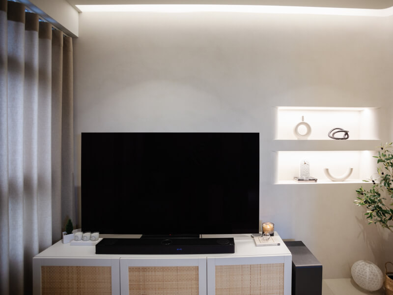
Cloud Dancer sits on the warmer, softer side of white, which gives you room to build around it without the palette turning cold. Natural materials do most of the work: oak or walnut joinery, a jute or wool rug, linen curtains, ceramic and stone accessories.

Contrast comes from finish as much as from colour. A matte wall against a satin skirting, or a textured feature wall beside smooth painted returns, creates separation the eye reads as detail even when everything is broadly the same shade. The comparisons set out in matte vs. eggshell vs. satin are a useful reference when deciding which surface takes which sheen.

Textiles carry more of a white scheme than most people expect. A heavy linen curtain, a slubby cushion cover and a rug with some pile give a room depth at eye level and below, which takes the pressure off the walls to be interesting on their own.

Greenery is the cheapest form of contrast available. A single large plant against a pale textured wall casts moving shadow through the day, and that does more for the character of a room than another cushion ever will.

Where A White Textured Wall Works Hardest

Some rooms benefit more than others:

  • Living rooms with large windows, where texture stops the brightness flattening everything
  • Bedrooms that need to feel restful without going dark
  • Compact studies and nooks, where a pale surface keeps the space open but texture prevents it feeling bare
  • Retail and cafe interiors, where a neutral backdrop lets stock or artwork carry the colour

Getting The Undertone Right

Whites are not interchangeable. Some lean pink, some lean green, and the difference only reveals itself once a large area has been covered. Sampling a decent-sized patch, at least a metre square, and looking at it both morning and evening will tell you far more than a paint chip held against a wall for ten seconds.

Pay attention to what the room already contains. Cool grey floor tiles drag a warm white towards beige by contrast, while warm timber flooring can make a cool white look faintly blue. Choosing a wall shade in isolation is the most common reason a white scheme ends up feeling slightly off without anyone being able to explain why.

Ceiling treatment is the quiet half of this. Carrying a slightly lighter or flatter white overhead keeps the walls looking intentional, and stops the room reading as one continuous, undifferentiated surface.

Keeping It Practical

Pale surfaces attract scrutiny, so durability and cleaning are fair questions to ask early. Textured finishes generally cope better with everyday marks than flat emulsion, since a varied surface disguises small scuffs, though deeper textures do take a little more effort to dust down.

High-traffic zones such as corridors and stairwells benefit from a harder-wearing specification, and skirting-height areas take most of the damage in any home with children or pets.

Think about where hands actually land. Light switches, door edges and the wall beside a sofa arm collect marks faster than anywhere else, and a slightly more robust specification in those spots keeps the rest of the scheme looking fresh for longer.

Touch-ups are easier to plan than to improvise. Keeping a small quantity of the same batch, along with a note of the application method used, means a future repair blends in instead of announcing itself as a patch.

Bringing The Look Home

A soft white scheme rewards restraint and good materials more than a big budget. Choose a surface with some life in it, keep the undertones consistent across the room, and let timber and textiles supply the warmth.

Metallics need a light hand as well. A subtle pearlescent or a soft champagne detail lifts a pale scheme, while a strong metallic finish across an entire wall pulls the room somewhere considerably more formal than a soft white was ever going to suggest.

If you would like to see how different finishes behave in a soft white, Wallhub’s gallery has samples applied across a range of techniques so you can compare them side by side. Drop in or get in touch with our team, and we will help you land on something that feels calm instead of empty.