Did you know that colours play a crucial role in affecting human moods? Although everybody perceives colours slightly differently, their effect can be universal.
As a result, it is essential to be surrounded by mood-elevating colours and understand what works and what does not, especially in your home. To do so, you would have to decide on the right wallpaper shade that would fit your space — whether it would be light or dark.
However, wallpapers come in various colours and hues; how can one choose? Picking a favourite colour is one thing — committing to a shade of wallpaper is another. There is so much pressure put into selecting the most suitable one for your home.
But do not fret, because we will go in-depth about choosing between light or dark in this article.
Let us share the differences between the two to help you decide on the perfect wallpaper for the atmosphere you are going for.
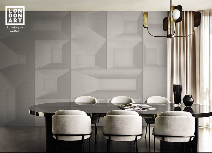
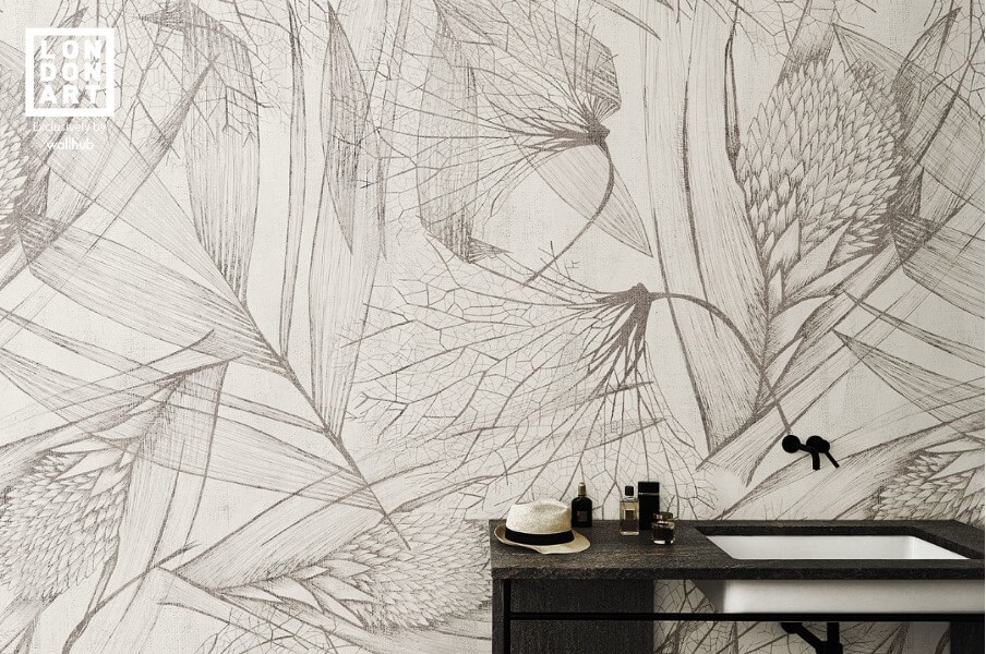
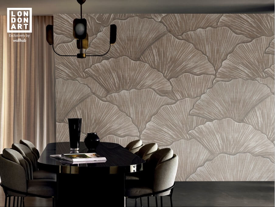
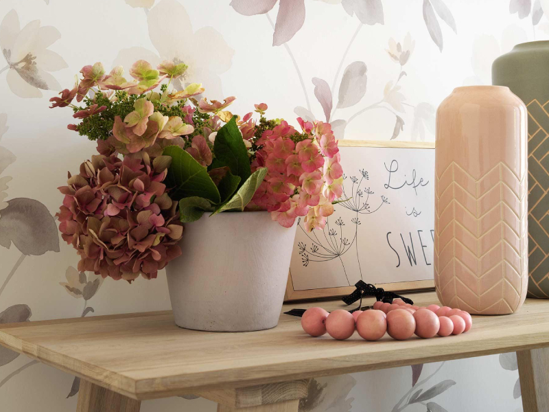
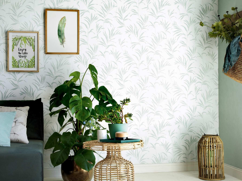
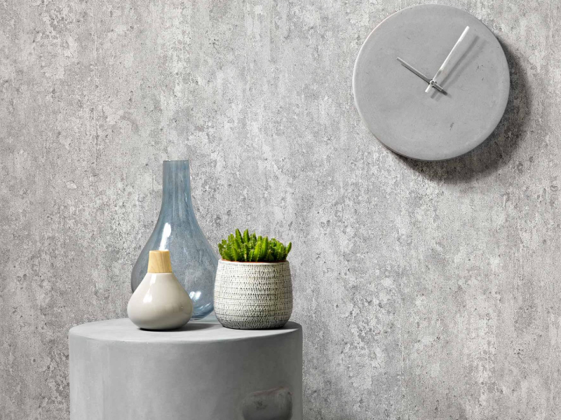
Light coloured wallpapers
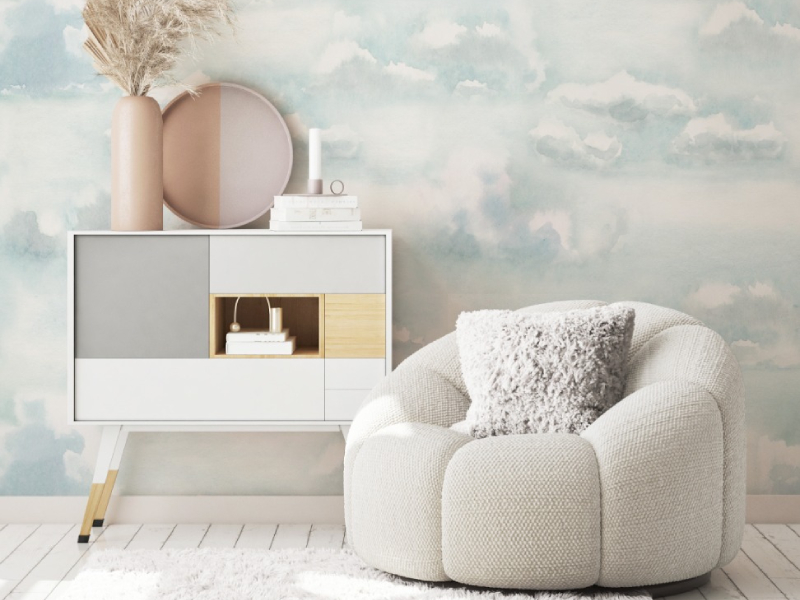
It is no secret that light colours give off a refreshing and lighthearted feel. This applies to wallpapers as well. Light coloured wallpapers give your space a more welcoming and open vibe.
As a result, they are perfect for any room size; In a sense, they even make smaller rooms look more spacious, and they are also great for a room with less lighting as light colours give the space an illusion that it is brighter.
Additionally, light coloured wallpapers are best for creating a more relaxed environment, rather than an intense look. Thus, they are excellent for areas you want to create a calm and cosy feeling, such as a bedroom or home office.
A popular sub-category of light colours is pastels. They give colours to the space but are peaceful to the eyes since they are much less overwhelming than most bright colours.
If you want a more classic and chic look but still stick to lighter colours, you can use soft neutrals such as beige, grey, and even traditional white.
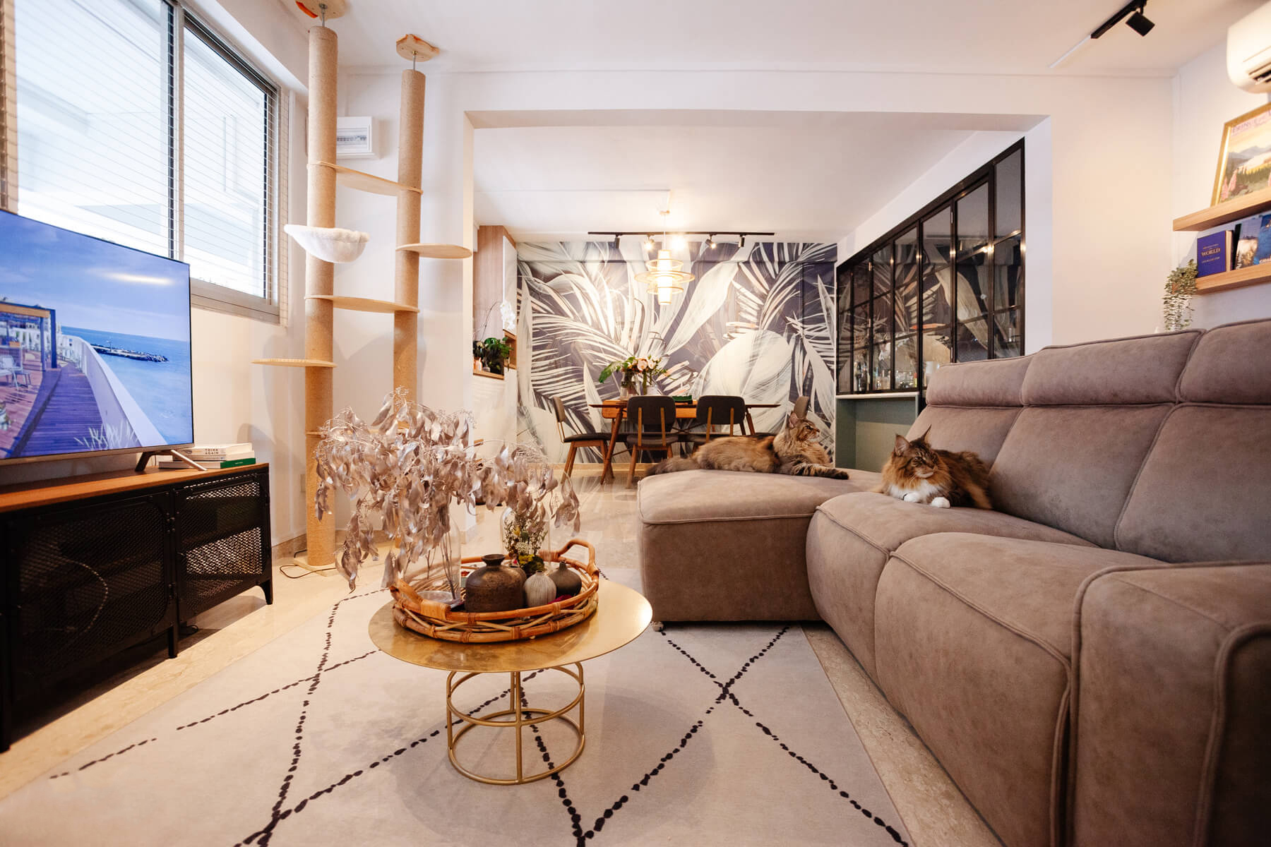
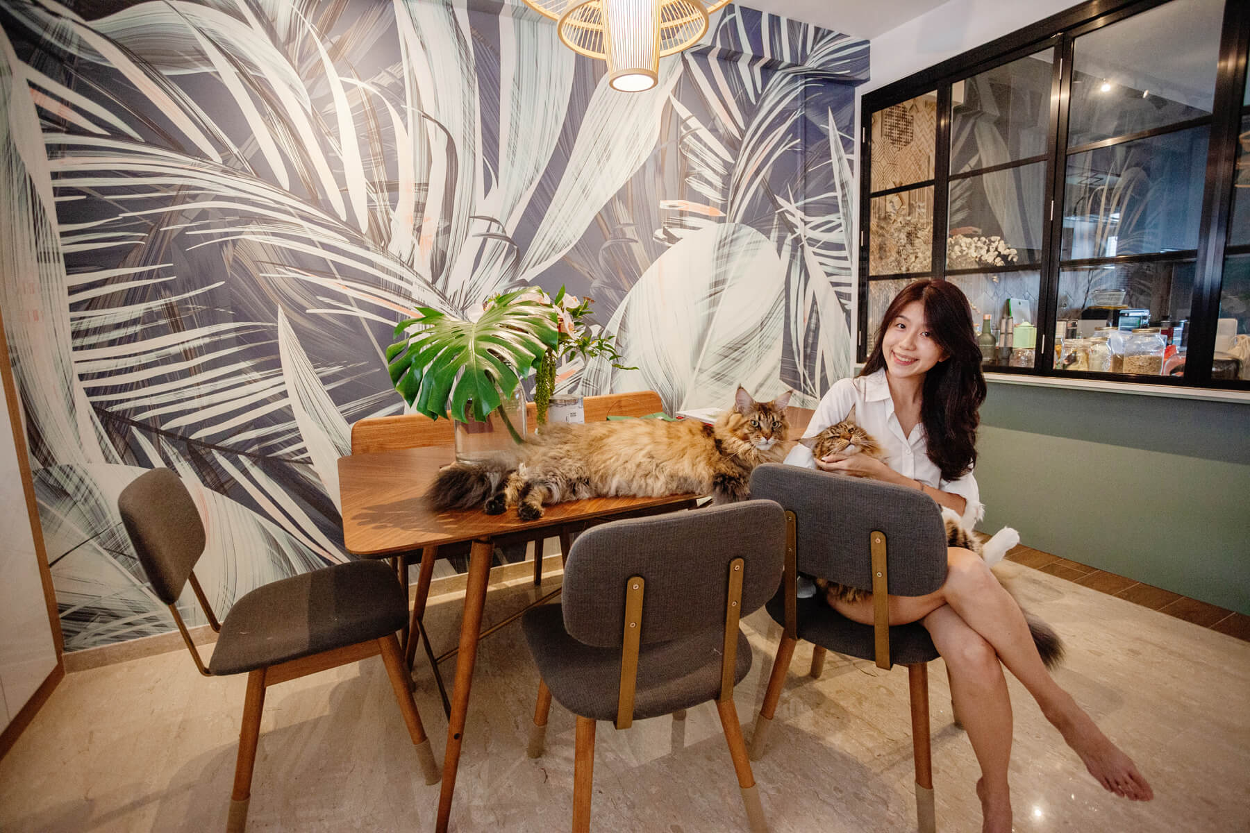
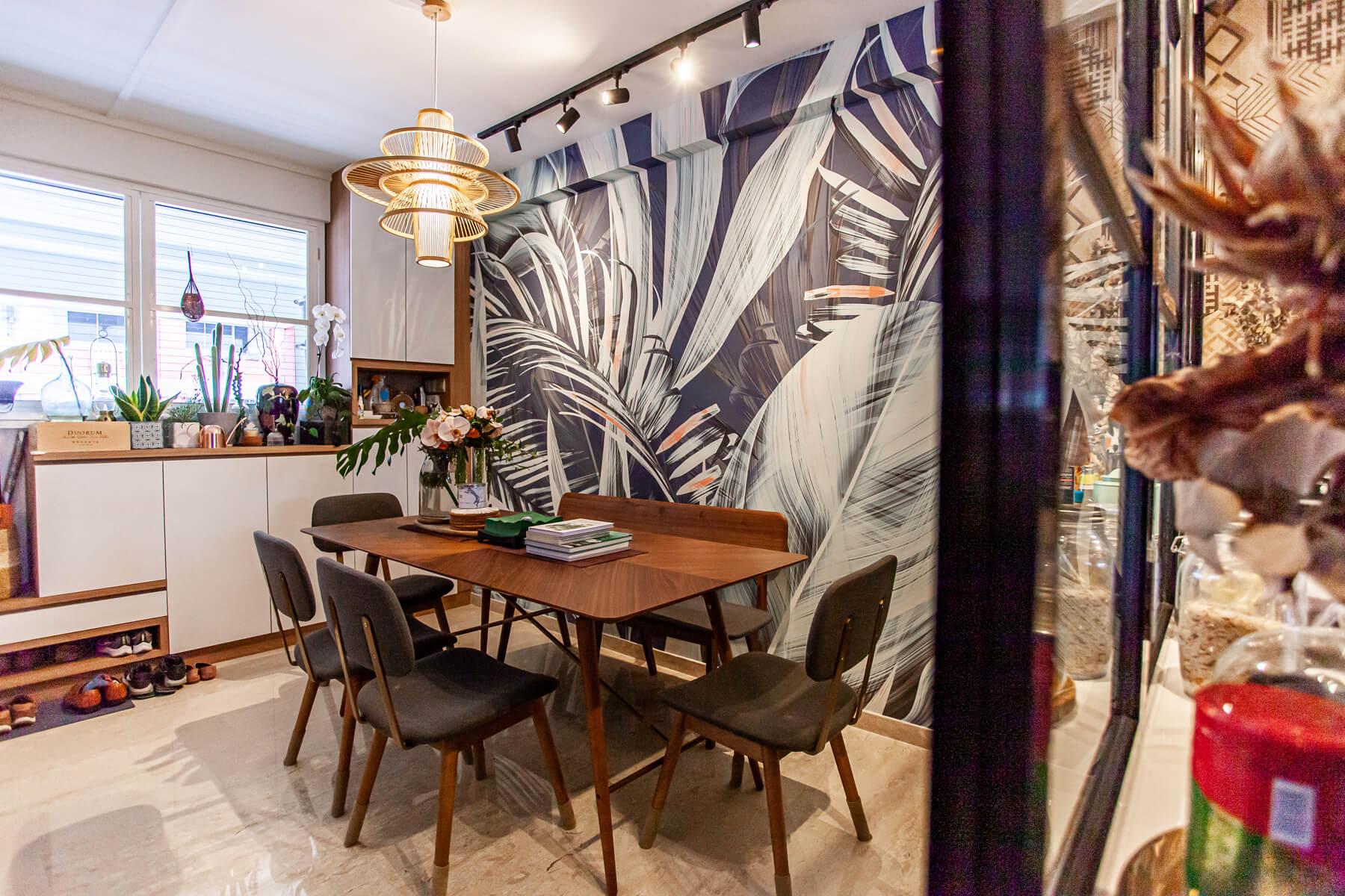
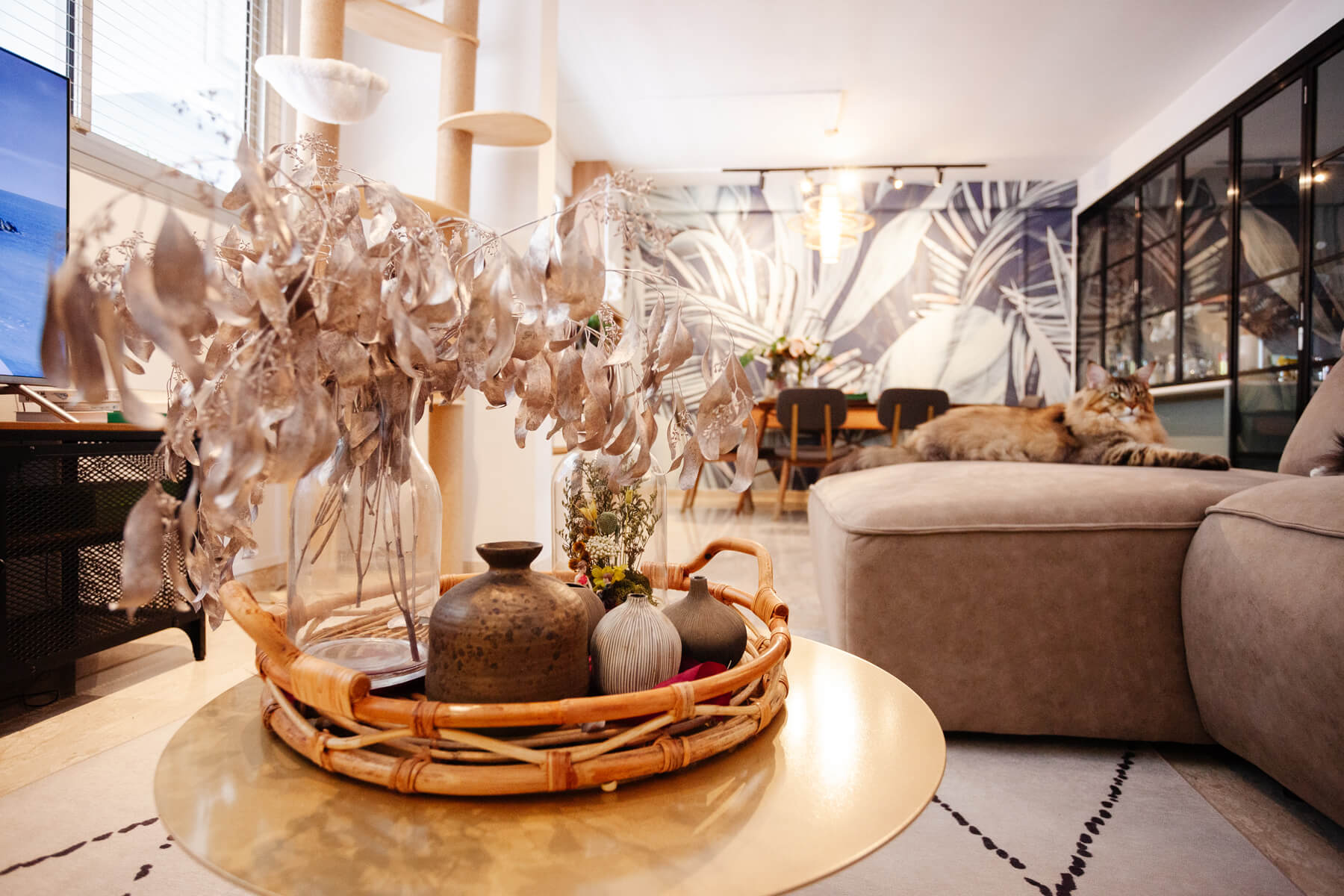
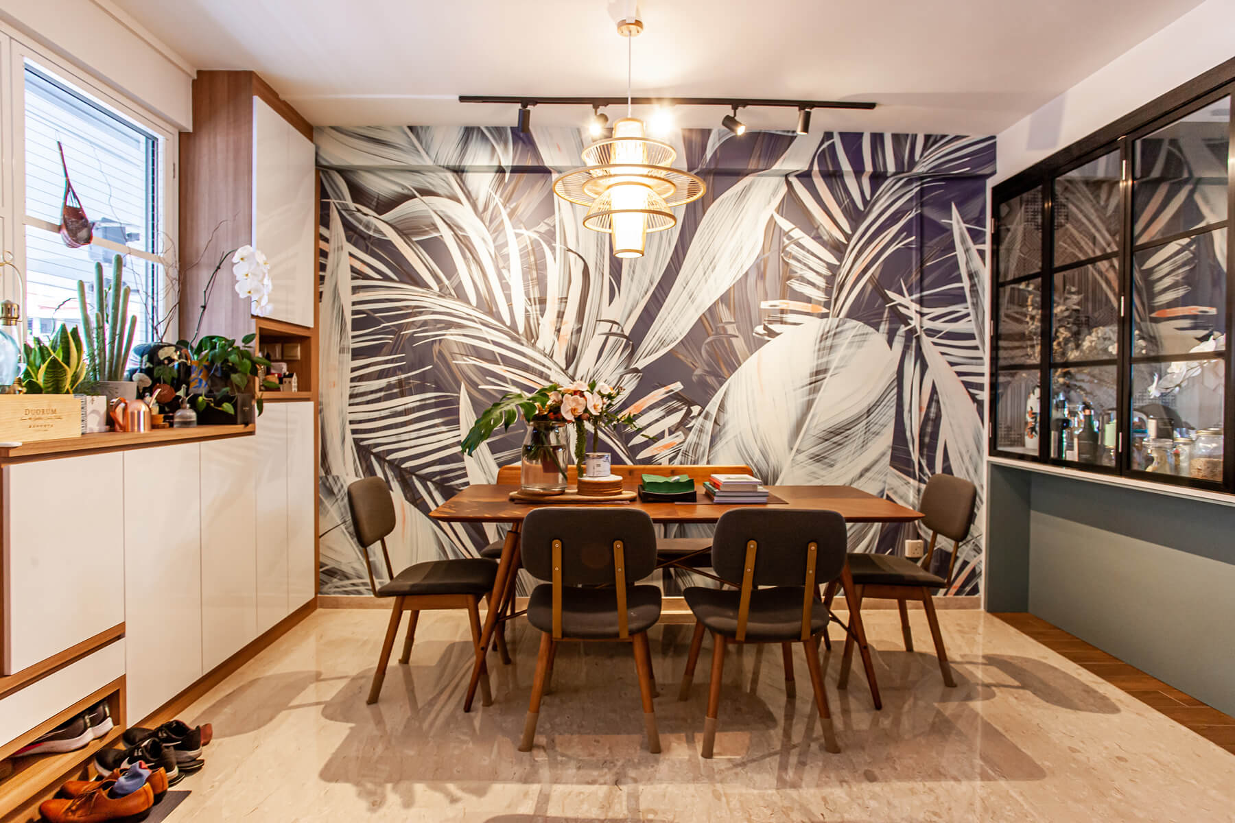
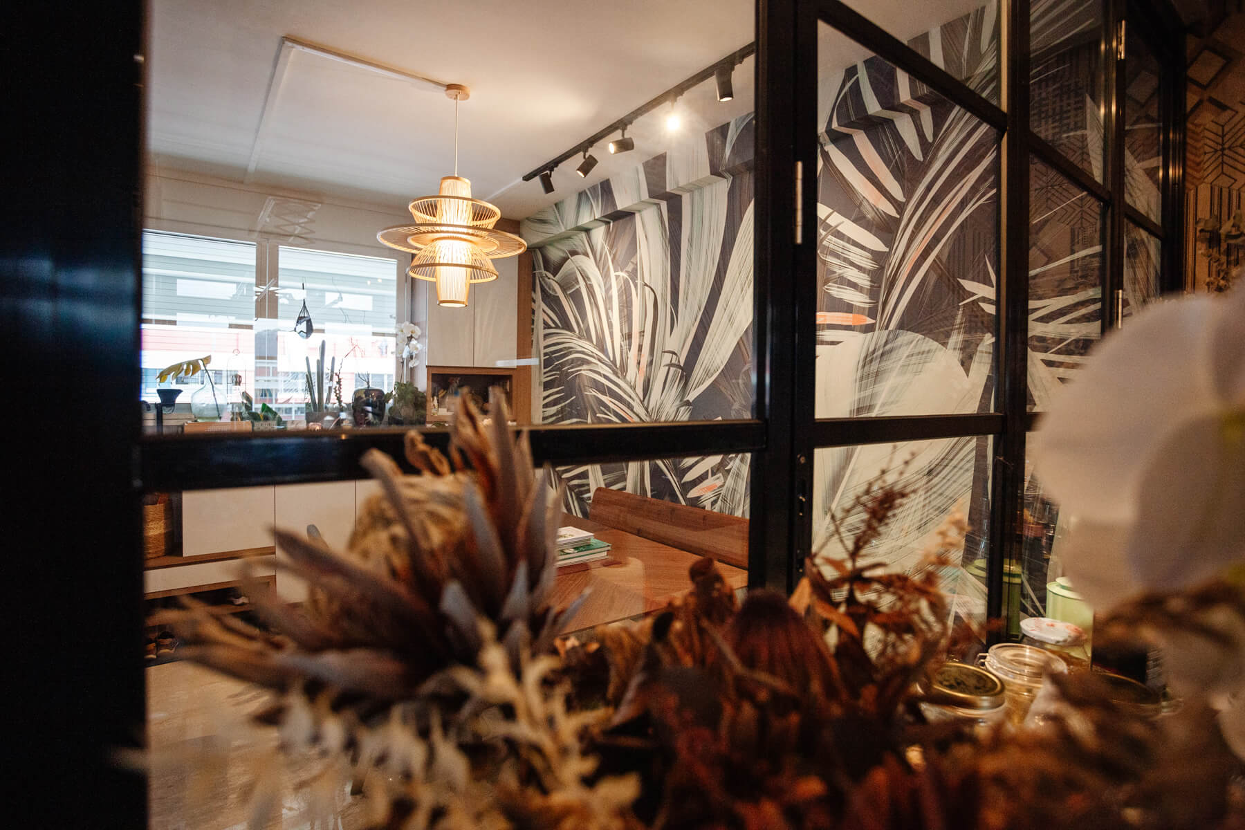
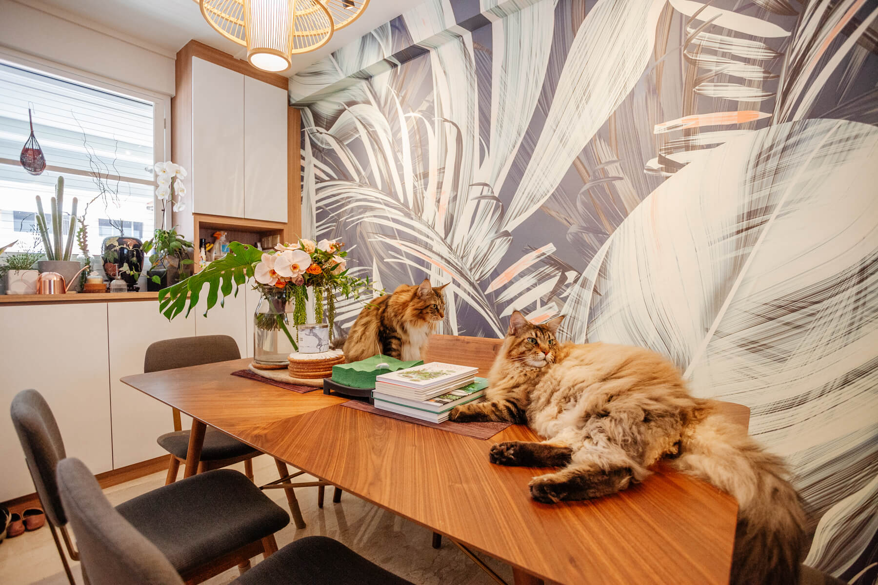
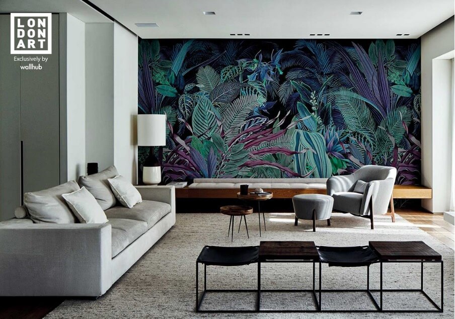
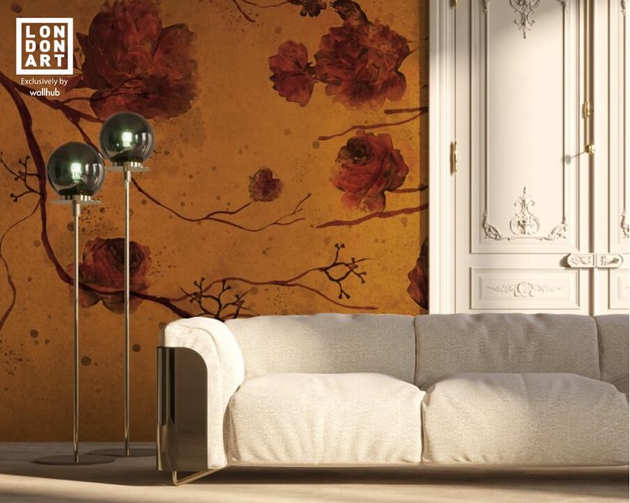
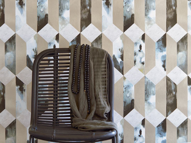
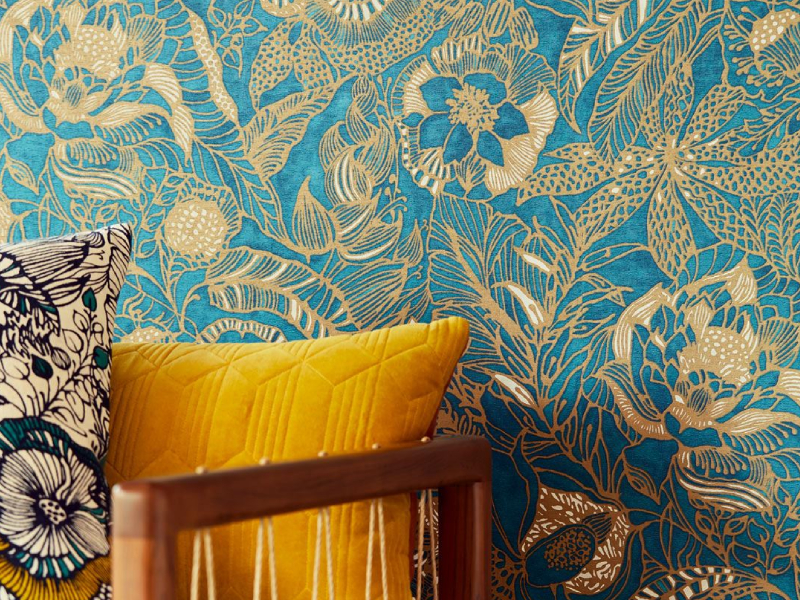
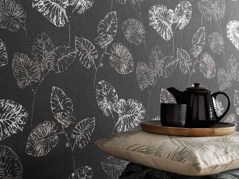
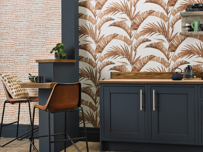
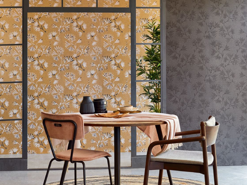
Dark coloured wallpapers
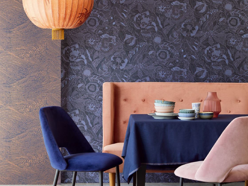
If lighter colours give off a welcoming and lighthearted feel to your space, dark coloured wallpapers do the opposite — they make the room feel more intimate and enclosed.
As a result, dark colours do not go well with small areas; they look best in spacious rooms. However, you can still incorporate a darker aesthetic into your home if you have a smaller space by creating a dark accent wall.
Moreover, if you want to make an impression, darker coloured wallpapers are the perfect option as they give a luxurious and dramatic impact to the area.
Darker colours are more suitable in the living room and even bedrooms for a more private and intimate feel. Additionally, dark colours look best in rooms with sufficient lighting or windows to prevent the room from being swallowed by darkness.
Dark neutrals, such as black, dark grey, and dark brown, have gained popularity in modern interior designs because they are rich in expression and are incredibly versatile in terms of what other colours you can pair them with.
Conclusion
Different shades will give a room a distinct look and feel, altering the mood. Therefore, when selecting the perfect wallpaper for your space, consider how its shade will interact with the area to see if it will create the exact feeling that you desire. Whatever the style used, whether it’s a floral, brick or Japanese wallpaper, the mood you want to achieve will be affected just as much by the lightness or darkness of its colours.