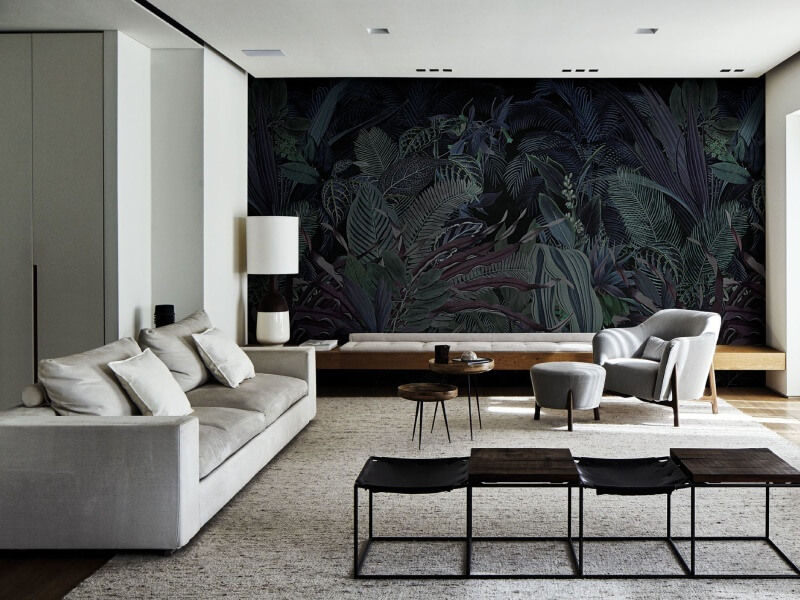
Best Wallpapers for HDB Flats: Maximising Space and Style

Best Wallpapers for HDB Flats: Maximising Space and Style

Decorating an HDB flat comes with its own unique set of challenges. The rooms tend to be compact, the layouts are often fixed, and you want every design choice to work hard for you, whether that means making a space feel bigger, brighter, or simply more like home. It is a balancing act that many Singaporean homeowners know all too well.

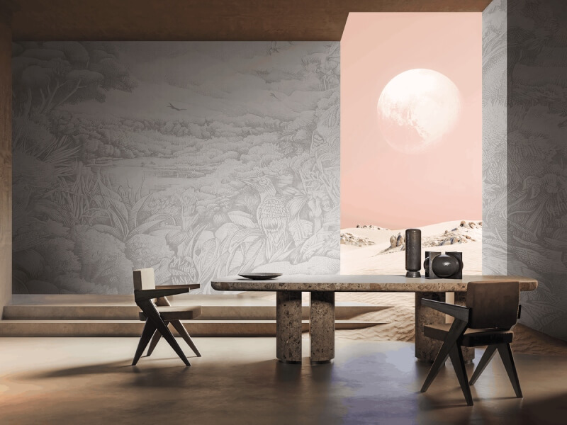
The good news is that wallpaper has quietly become one of the most effective tools for transforming a flat without a full renovation. Wallpaper in Singapore has grown enormously in popularity over the past few years, and it is easy to see why. With the right pattern, texture, or colour, a single accent wall can completely shift the feel of a room, adding depth, personality, and visual interest in a way that paint alone rarely achieves.

Why Wallpaper Works So Well in HDB Flats
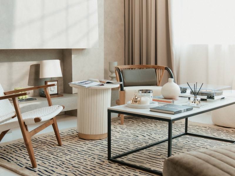
Why Wallpaper Works So Well in HDB Flats

HDB flats are functional by design, but that does not mean they have to feel clinical or boxy. Wallpaper gives you the flexibility to introduce character into a space without committing to major structural changes. It is also far more forgiving than most people expect. Modern wallpapers are designed to be removable, washable, and long-lasting, which makes them a practical choice for rental flats or for homeowners who like to refresh their interiors every few years.

Beyond aesthetics, wallpaper is genuinely useful in small spaces. Vertical stripes draw the eye upward, making ceilings feel higher. Large-scale prints can paradoxically open up a room rather than overwhelm it. Textured wallpapers add warmth and dimension without taking up physical space. These are not just design theories; they are tricks that interior stylists have used for decades to make compact rooms feel more generous.

Choosing the Right Style for Each Room
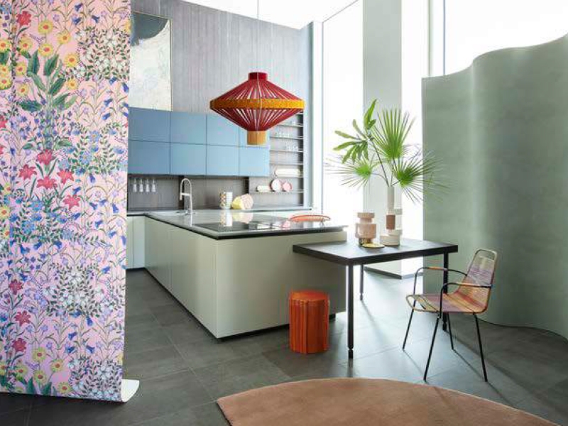
Choosing the Right Style for Each Room

Not all wallpapers are created equal, and the right choice depends heavily on the room you are working with.

Living Room

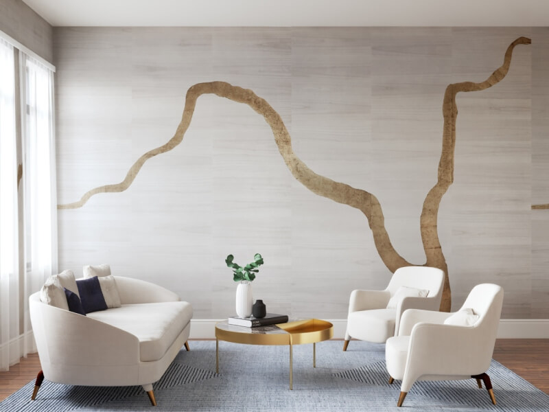
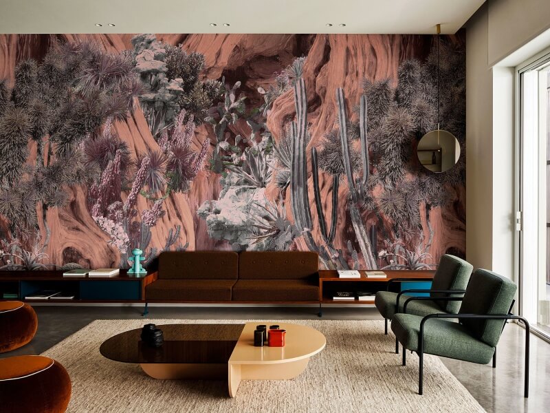
The living room is often the first space guests see, so it is worth making an impression. A feature wall behind the sofa or television unit is the most popular approach in HDB flats, and for good reason. It creates a focal point without overwhelming the entire space.

For smaller living rooms, consider:

  • Soft geometric patterns in neutral tones, which add interest without visual noise
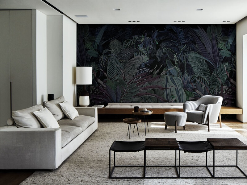
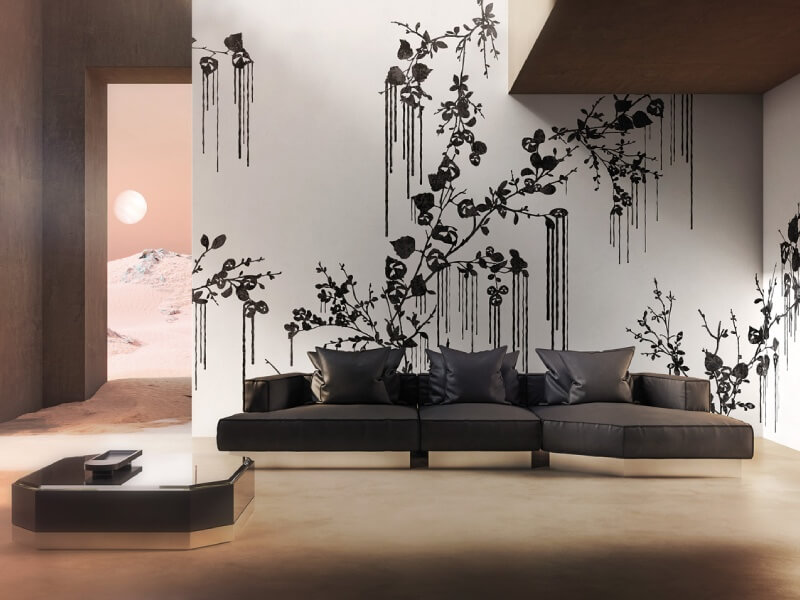
  • Botanical or nature-inspired prints, which bring a sense of the outdoors in
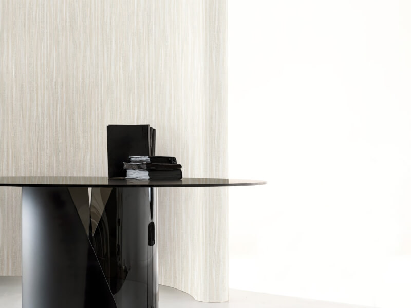
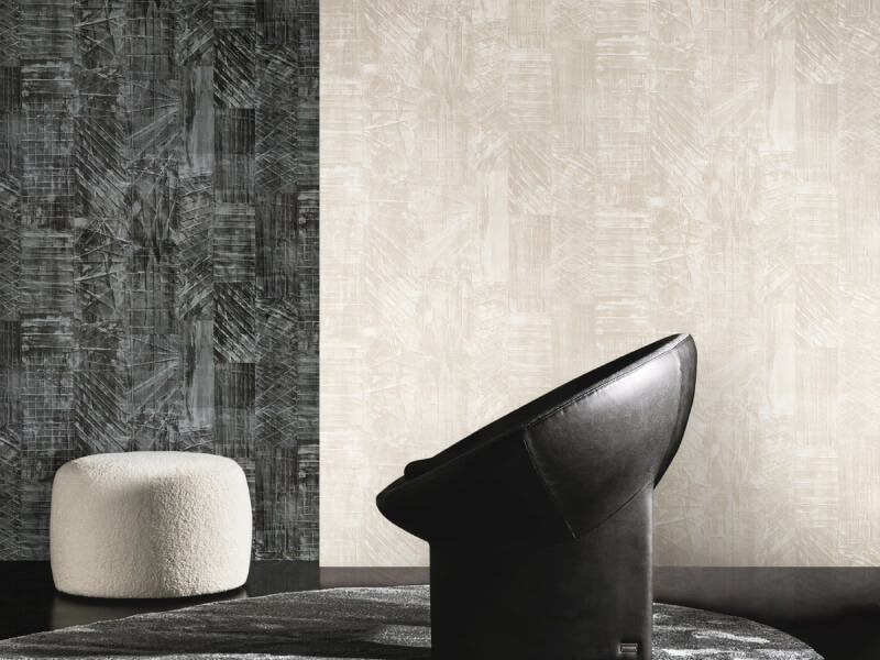
  • Subtle textured wallpapers in linen or grasscloth finishes, which add depth and warmth
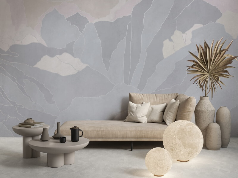
  • Light-coloured murals or abstract designs, which can make a wall feel like a piece of art

Avoid very dark or heavily saturated wallpapers across all four walls, as they can make an already compact room feel enclosed. One statement wall is usually enough.

Bedroom

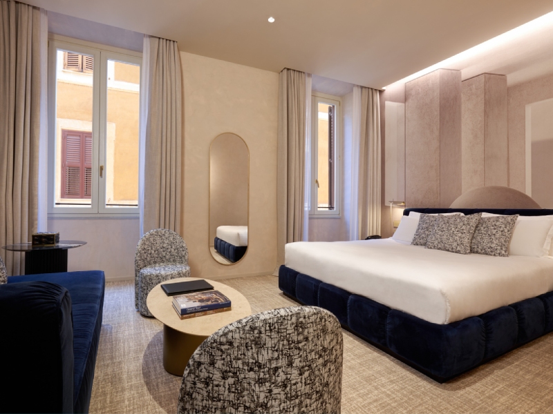
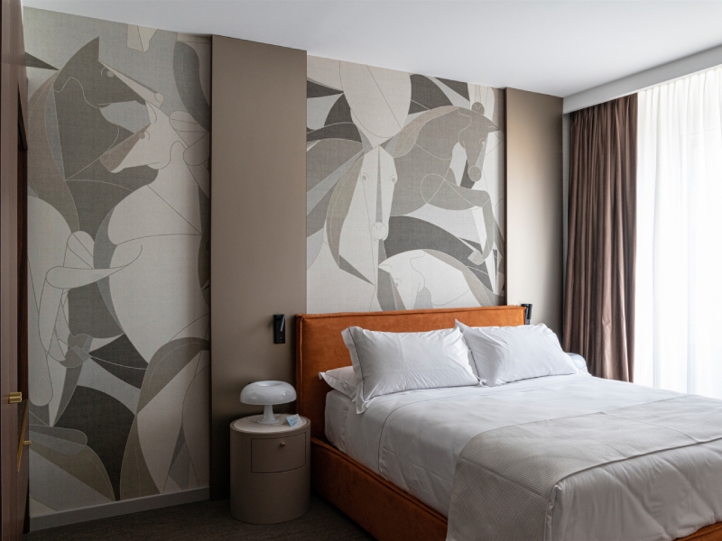
The bedroom is where you have the most freedom to be expressive, since it is a personal space rather than a communal one. Many HDB homeowners opt for a wallpapered headboard wall, which anchors the bed and gives the room a polished, hotel-like quality.

Calming tones work best here: soft blues, warm greiges, sage greens, and blush pinks all photograph beautifully and tend to age well. If you prefer something bolder, a dark floral or moody abstract print on just the headboard wall can feel dramatic without being oppressive.

Children’s Room

Children’s rooms are a great place to have fun with wallpaper, knowing that tastes will change as they grow. Stick to wallpapers that are easy to clean and, ideally, removable. Playful patterns, illustrated animals, or softly coloured geometric designs are all popular choices that can grow with a child for several years before needing a refresh.

Study or Home Office

A dedicated study or home office benefits from a wallpapered wall that signals focus and intention. Darker, richer tones like forest green, navy, or terracotta work well in this context. They create a cosy, library-like atmosphere that is also surprisingly good on video calls.

Practical Tips Before You Buy
Practical Tips Before You Buy

Before committing to any wallpaper, there are a few things worth considering to avoid common mistakes.

Get your measurements right. HDB rooms are small, but even a slight miscalculation can leave you short of material. Always buy a little more than you think you need, as dye lots can vary between print runs.

Consider the light in your flat. North-facing rooms tend to be cooler and dimmer, so warmer-toned wallpapers can help balance this out. South-facing rooms get plenty of light, which means you have more flexibility with colour.

Think about the finish. Matte wallpapers have a more natural, understated look, while vinyl-coated options are easier to wipe down. This matters particularly if you are thinking about wallpaper in kitchens and bathrooms, where moisture and splashes are a daily reality.

Test before you commit. Many wallpaper suppliers offer sample swatches. Stick a sample on your wall and live with it for a day or two before placing a full order. The difference between how a pattern looks on a screen and how it looks in your actual space can be significant.

Pairing Wallpaper with the Rest of Your Interior
Pairing Wallpaper with the Rest of Your Interior

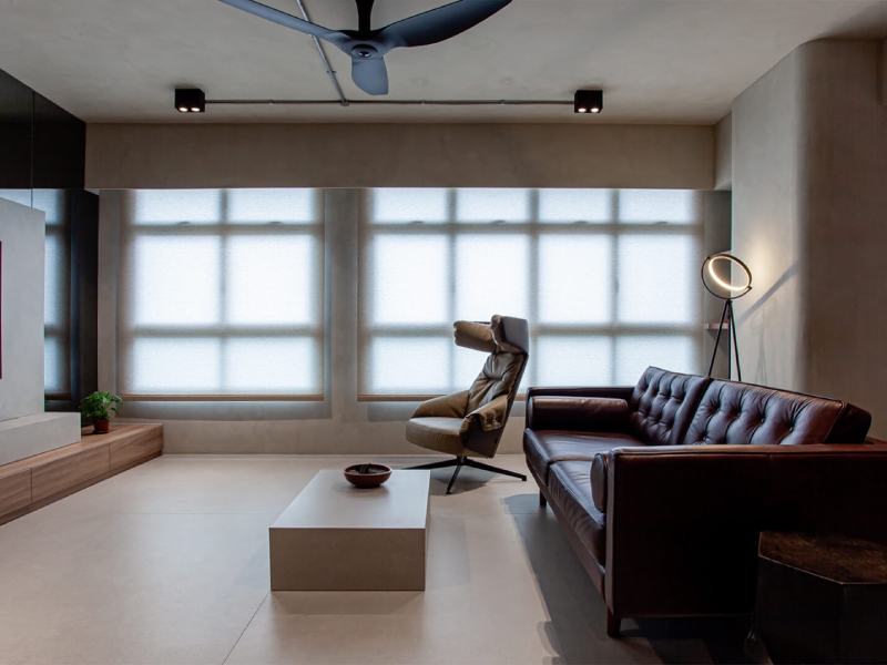
Wallpaper rarely exists in isolation. For it to look considered rather than accidental, it needs to work alongside your flooring, furniture, and soft furnishings. A general rule of thumb: if your wallpaper is busy, keep your furniture and textiles simple. If your wallpaper is understated, you have more freedom to layer in bolder accessories.

Wood tones are a reliable companion to almost any wallpaper. The warm, natural texture of timber furniture or flooring grounds even the most graphic prints and prevents a space from feeling flat. Similarly, plants, rattan, and linen fabrics all pair well with nature-inspired wallpaper designs, which tend to be popular in HDB flats precisely because they make small spaces feel more alive.

Finding the Right Wallpaper for Your Home

Choosing wallpaper for an HDB flat does not have to be complicated, but it does reward a little thought. Start with the room you want to transform most, identify the one wall that would benefit most from a focal point, and work outward from there. The right wallpaper will not just change how your flat looks; it will change how it feels to live in.

If you are ready to explore your options, Wallhub is a great place to start. With a wide range of wallpapers suited to different aesthetics, budgets, and room types, our team can help you find something that genuinely works for your space. Visit Wallhub to browse our collection or get in touch for personalised advice.

How Wallpaper Patterns Can Influence Mood: From Calming to Energising

How Wallpaper Patterns Can Influence Mood: From Calming to Energising

Have you ever experienced walking into a room and immediately feeling something? Perhaps it’s calm and soothing. Maybe it feels lively and energising. Occasionally, it might even make you uneasy without a clear reason why. While lighting, furniture, and layout all contribute to a room’s atmosphere, another element shapes our emotional response: the patterns on the walls.

In recent years, researchers and designers have become increasingly interested in how visual environments affect the human mind. One field exploring this connection is neuroaesthetics, which studies how aesthetic experiences influence brain activity, emotions, and behaviour. It blends insights from neuroscience, psychology, and art to understand why certain designs make us feel relaxed, focused, or inspired.

Wallpaper, often chosen purely for decorative reasons, is actually part of this psychological landscape. The colours, patterns, and textures covering your walls may subtly shape how your brain processes the space around you. Hence, if you’ve been browsing for wallpaper in Singapore recently, it is worth understanding how these visual elements might influence your mood.

Visual Elements In Wallpaper Influence Mood

How Visual Stimuli Affect the Brain

Humans are highly visual creatures. A large portion of the information our brains process each day comes from what we see. Because of this, our surroundings constantly send signals to our brain, even when we are not consciously paying attention. When you look at a patterned wall, the visual information first travels through the optic nerve to the brain’s visual cortex. This area processes basic features such as colour, contrast, shape, and movement. However, the journey does not stop there.

Other areas of the brain become involved almost immediately. The limbic system, which helps regulate emotion, responds to visual cues that signal comfort, safety, or excitement. Meanwhile, the prefrontal cortex—the region responsible for planning and decision-making—interprets patterns and structure in ways that influence focus and cognitive clarity.

Even the motor cortex may become subtly activated when our environment encourages alertness or readiness to act. In other words, our brain does not simply “look” at a wall. It interprets it emotionally, cognitively, and sometimes even physically.

This is why interior design choices can have a deeper psychological impact than we often realise. A calm, orderly space may promote relaxation, while a visually chaotic one might trigger mild stress or distraction.

The Role of Emotional Memory and Personal Associations

While certain patterns and colours tend to evoke similar reactions in many people, individual experiences still play a major role in how we interpret visual environments. Our emotional memory, which is closely linked to the amygdala, influences how we respond to particular colours or designs. For instance, a warm yellow wall might remind someone of a cheerful childhood kitchen, creating a comforting feeling. For another person, that same shade could feel overwhelming or even irritating.

Cultural influences also shape aesthetic preferences. Patterns that appear elegant or traditional in one culture may feel unfamiliar or intense in another. Personal taste, upbringing, and past experiences all interact with the brain’s processing of visual stimuli.

Because of this, the most effective design choices often depend on how well a space aligns with its intended function and the emotions it is meant to evoke. A calming bedroom environment, for example, may benefit from soft, gentle patterns, while a creative workspace might thrive with more stimulating visuals.

The Role of Emotional Memory and Personal Associations

Why Patterns and Textures Influence Mood

When people think about wallpaper, colour is usually the first feature that comes to mind. Yet pattern and texture can be just as influential when it comes to shaping our perception of a room.

Patterns introduce rhythm and repetition into a space. The brain naturally looks for structure and predictability, which is why certain repeating designs can feel organised and reassuring. Symmetrical patterns often create a sense of balance because they are easy for the brain to interpret.

In contrast, irregular or organic patterns can spark curiosity. Because they contain more variation, they encourage the brain to explore and interpret the design more actively. This can be stimulating, particularly in environments where creativity is encouraged.

Contrast also plays an important role. Designs with strong colour contrasts may increase alertness, but they can also become visually tiring if used extensively. Over time, too much contrast can make it difficult for the brain to maintain focus.

The Impact of Pattern Scale

Beyond the type of pattern, scale can significantly affect the mood of a room. Large patterns tend to feel dramatic and immersive. They create strong visual impact and can transform a wall into a statement feature. However, in smaller spaces, they may dominate the room and feel overwhelming.

Smaller patterns, on the other hand, are generally more subtle. They blend into the background more easily and create a gentle sense of texture rather than commanding attention. Spacing between repeating elements also matters. Tight, closely packed patterns may feel energetic and dynamic, while designs with more open space often appear calmer and more breathable.

The Role of Texture

Even when it is purely visual, texture adds another dimension to wallpaper design. Matte finishes or fabric-like textures tend to create warmth and softness, which can make a space feel more inviting. Reflective or glossy surfaces, meanwhile, may add brightness and vibrancy but sometimes introduce a cooler, more energetic atmosphere.

Because our brains respond to these subtle cues, thoughtful combinations of pattern, scale, and texture can quietly influence how comfortable or stimulating a room feels.

The Role of Texture

When Does Wallpaper Design Become Overstimulating?

While visually rich environments can be engaging, too much complexity may lead to cognitive overload. This occurs when the brain is presented with more visual information than it can easily process. Overly busy patterns, clashing colours, or dense visual textures can make it difficult for the mind to relax or concentrate. Instead of creating interest, the environment may start to feel chaotic.

Some common signs of visual overstimulation include:

  • Feeling unusually stressed in a room
  • Eye fatigue or restlessness
  • Difficulty concentrating
  • Lower productivity or mental fatigue

If you have ever walked into a room and felt subtly uncomfortable without knowing why, the visual environment (including the wallpaper) may have been contributing to that sensation.

When Does Wallpaper Design Become Overstimulating?

How Different Wallpaper Patterns Shape Mood

Although personal reactions vary, certain pattern styles tend to produce broadly similar psychological responses.

1. Geometric Patterns: Order and Mental Clarity

Geometric wallpaper featuring shapes such as hexagons, diamonds, or clean linear designs often communicates structure and organisation. Because the brain easily recognises repeating shapes, these patterns can create a sense of predictability.

In workspaces or study areas, geometric patterns may help reinforce focus and mental clarity. However, extremely sharp angles or high-contrast designs can sometimes feel rigid if used too extensively.

2. Nature-Inspired Patterns: Calm and Restoration

Patterns inspired by nature, such as leaves, vines, florals, or flowing organic shapes—often promote relaxation. This reaction may be linked to biophilic design, a concept suggesting that humans feel more comfortable when surrounded by elements reminiscent of the natural world.

Soft botanical patterns can create a tranquil environment, making them particularly suitable for bedrooms, lounges, and reading spaces.

3. Abstract Patterns: Energy and Creativity

Abstract wallpaper designs break away from predictable structure. With irregular shapes, flowing lines, and unexpected colour combinations, they encourage curiosity and imaginative thinking.

These designs often work well in creative environments such as art studios, cafés, or collaborative workspaces. However, moderation is key, as overly chaotic designs can feel distracting rather than inspiring.

4. Minimalist Patterns: Subtle Calm

Minimalist patterns take a different approach by keeping visual complexity low. Gentle stripes, faint motifs, or lightly textured surfaces add depth without overwhelming the senses.

These understated designs for meditation and mindfulness are especially useful in smaller rooms where bold patterns might feel cramped. By reducing visual noise, minimalist wallpaper allows the brain to relax while still maintaining visual interest.

Choosing Wallpaper Based on Room Function

Since wallpaper influences emotional tone, selecting the right pattern often depends on how a room is used.

  • Bedrooms:
    Spaces dedicated to rest benefit from soothing visuals. Soft florals, flowing patterns, or muted geometric designs can create a peaceful atmosphere that encourages relaxation and better sleep.
  • Living Rooms:
    Living rooms often serve as multifunctional areas for conversation, entertainment, and relaxation. Balanced patterns—neither too bold nor too subtle—can provide character without overwhelming the space.
  • Home Offices:
    Workspaces typically require visual clarity and minimal distraction. Subtle geometric patterns or light textures can add personality while still supporting concentration.
  • Creative Areas:
    Rooms dedicated to hobbies, brainstorming, or artistic work can accommodate more expressive designs. Bold patterns and abstract styles may help stimulate imagination and fresh ideas.

Choosing Wallpaper Based on Room Function

Conclusion

The spaces we inhabit communicate with our minds in discreet but impactful ways. Walls are often treated as simple backdrops, yet they constantly influence how we feel, think, and behave throughout the day. Thus, wallpaper patterns, colours, and textures do more than decorate a room; they shape its emotional atmosphere. From calming botanical designs to energising abstract motifs, each pattern carries subtle psychological signals that our brains interpret automatically.

Understanding how these visual elements interact with our cognitive and emotional responses allows homeowners to make more intentional design choices. The result is not just a more beautiful interior, but a space that supports the mood, focus, and wellbeing we want to cultivate every day.

Creative Ways to Mix Wallpapers and Paint Without Clashing

Creative Ways to Mix Wallpapers and Paint Without Clashing

Homeowners planning to refresh their interiors often assume they must choose between wallpaper or paint when updating their walls. For years, the common rule was to pick one and commit to it. However, modern interior design trends are increasingly proving that you don’t actually have to make that choice anymore.

Today, more homeowners and designers are experimenting with both finishes in the same space. When one combines wallpaper and paint, they can craft more striking accent walls, add subtle texture, and create interiors that feel thoughtfully layered rather than flat or predictable. When done well, the result is a space that feels cohesive, polished, and uniquely personal.

Of course, mixing two different wall treatments can feel intimidating at first. Without careful planning, the room may end up looking cluttered or mismatched. The good news is that with a few design principles in mind, it’s surprisingly easy to blend wallpaper and paint in a way that feels harmonious and intentional. In this guide, we’ll explore why this design approach works so well and share creative techniques to combine wallpaper and paint without overwhelming your space.

Combine Wallpaper And Paint Without Overwhelming Your Space

Why Combine Wallpapers and Paint in Interior Décor?

At its simplest, the answer is because the results can look stunning when executed thoughtfully. Mixing wallpaper and paint introduces visual variety while allowing you to highlight architectural features or create focal points within a room. Wallpaper brings pattern, texture, and personality to a space. Paint, meanwhile, offers flexibility and a wide range of finishes that help balance more detailed surfaces. Together, they create a layered design that feels dynamic without being chaotic.

Another major reason designers favour this technique is practicality. High-quality wallpaper can be expensive, especially when used on every wall in a room. Pairing wallpaper with painted surfaces allows homeowners to enjoy the richness of patterned walls while keeping renovation costs manageable. This combination also adds dimension. Imagine a tactile, embossed wallpaper paired with a smooth matte wall finish. The contrast between textures draws the eye and makes the room feel more visually engaging. This effect works particularly well in modern, Scandinavian, and contemporary interiors.

To maintain cohesion, many designers rely on colour harmony. One approach is to choose shades from the same colour family. For instance, a wallpaper featuring dusty blues and soft greys could be paired with a coordinating blue-grey paint. Another strategy is to create contrast by choosing colours opposite each other on the colour wheel, which can energise the room without feeling overwhelming.

Paint finishes can further enhance the look. Matte or mineral finishes such as limewash paint can soften the transition between surfaces and introduce subtle texture that complements patterned wallpaper. Lastly, the combination offers flexibility for future updates. Repainting walls is relatively simple compared to replacing wallpaper. If your tastes evolve over time, you can refresh the painted portions of the room while keeping the wallpaper as a design anchor.

Limewash Paint For The Transition Between Surfaces

How to Pick a Good Paint Colour and Wallpaper Pairing

Successfully combining wallpaper and paint largely depends on selecting colours and patterns that work well together. These tips can help simplify the process.

1. Pick Your Wallpaper First

Wallpaper usually contains multiple design elements—patterns, textures, and several colours. Because of this complexity, it’s far easier to choose a paint shade after you’ve selected your wallpaper. Once you find a wallpaper design you love, study its colour palette carefully. Many wallpapers include a background colour alongside accent tones. Pulling one of these shades into the surrounding paint creates an effortless sense of harmony.

For example, if your wallpaper features cream florals on a muted green background, using that same soft green as your paint colour helps tie the room together.

2. Always Buy Samples

Even if colours appear perfect online or in-store, they may look completely different in your home’s lighting. Sunlight, artificial lighting, and even the colour of nearby furniture can influence how shades appear.

Purchase small wallpaper samples and paint swatches before committing. Tape the samples to the wall and observe them at different times of the day. This simple step prevents costly mistakes and ensures the colours truly complement one another.

3. Consider Pattern Scale

Not all wallpaper patterns behave the same way in a room. Large, dramatic prints tend to dominate a space, while smaller patterns create subtle texture.

If you’ve chosen a bold wallpaper design, it’s best to pair it with a calm, understated paint colour so the room doesn’t feel overwhelming. On the other hand, delicate patterns often benefit from slightly richer paint tones to give the room visual balance.

4. Pay Attention to Undertones

Two colours might appear similar but still clash if their undertones differ. For instance, a grey paint with warm beige undertones may not pair well with a cool-toned blue wallpaper.

To avoid this issue, compare paint swatches directly with the wallpaper sample. Look for shared undertones, either warm or cool, to maintain a cohesive look throughout the room.

Pay Attention To Undertones

Popular Ways to Mix and Match Wallpaper and Paint

Once you’ve selected your colours, the next step is deciding how to arrange the two finishes within the space. These design approaches are among the most popular for achieving a balanced result.

1. Wallpaper Accent Wall with Painted Walls

One of the simplest and most widely used techniques is creating a wallpaper accent wall. This involves applying wallpaper to a single focal wall while painting the remaining walls in a coordinating shade. The wallpaper draws attention and acts as the centrepiece of the room, while the painted walls provide visual breathing room.

Bedrooms often place the accent wall behind the bed, while living rooms might highlight the wall behind a sofa or entertainment unit. Because only one wall is covered in wallpaper, this approach keeps the room from feeling visually crowded.

2. Half-and-Half Walls

Another stylish option is splitting the wall horizontally between wallpaper and paint. This design resembles traditional wainscoting but with a contemporary twist.

In most cases, wallpaper is applied to the lower half of the wall, while paint covers the upper portion. This arrangement allows you to showcase bold patterns without overwhelming the space. Choosing the right height for the transition line is important. Many designers place the dividing point roughly halfway up the wall or slightly higher, depending on ceiling height and furniture placement.

The lower wallpaper section can help anchor furniture pieces like beds, sideboards, or sofas, while the painted section keeps the room feeling light and open.

3. Create an Ombre Effect

An ombre wall gradually shifts from darker shades to lighter ones, creating a dramatic yet fluid colour transition. Combining wallpaper and paint makes this effect easier to achieve. Start by selecting two or three colours that blend naturally together. Wallpaper featuring gradient tones or abstract patterns works particularly well for this concept.

Once the wallpaper is installed, you can extend the gradient using paint. Begin with the darkest shade near the top of the wall and gradually introduce lighter tones as you move downward. Feather the edges between colours so the transitions appear soft rather than abrupt. This technique works beautifully in creative spaces, bedrooms, or feature walls where you want to make a bold statement.

4. Monochrome Pairing

For a calmer and more refined look, consider using wallpaper and paint within the same colour family. This monochrome approach creates subtle variation without introducing competing hues. For example, a navy wallpaper could be paired with softer sky-blue paint, or a sage patterned wallpaper could sit alongside pale green walls.

Because the colours are closely related, the room feels cohesive and relaxing. The wallpaper provides interest through pattern, while the paint keeps the overall aesthetic balanced. Minimalist interiors often use this method to add dimension without disrupting a serene atmosphere.

5. Painting Designs Over Wallpaper

If you enjoy creative projects, painting over wallpaper can produce truly unique accent walls. Textured or embossed wallpaper works especially well for this technique because raised patterns catch light and shadow once painted. Damask, geometric, or floral textures are excellent candidates.

Before painting, apply a high-quality primer to ensure proper adhesion. Once dry, use painter’s tape to protect edges or sections you want to keep untouched. Then, carefully paint over the wallpaper using brushes or small rollers, following the raised patterns where possible. A contrasting paint colour will highlight the design details, while a similar shade will create a more subtle effect.

With patience and attention to detail, this method can transform ordinary wallpaper into customised wall art.

A Simple Trick for Seamless Transitions

For a more designer-inspired finish, consider extending the wallpaper slightly onto adjacent walls, usually around 18 to 24 inches. The remaining wall space can then be painted in a coordinating colour.

This small overlap creates a softer visual transition between surfaces and gives the impression that the wallpaper extends further through the room. It’s a clever way to add visual depth while still keeping costs manageable. Another advantage of this technique is that it guides the viewer’s eye around the room, making the overall design feel intentional rather than segmented.

A Simple Trick For Seamless Transitions

Conclusion

Mixing wallpaper and paint opens up exciting possibilities for personalising your home’s interior. Instead of viewing the two materials as competing options, think of them as complementary tools that work together to create balance, texture, and visual interest. Regardless of how you want to go about it, the key lies in thoughtful colour selection and strategic placement.

When it’s time to apply everything, remember that order matters. It’s usually best to paint the walls first and install wallpaper afterwards. Painting first makes the process cleaner and allows you to easily correct any mistakes before the wallpaper goes up. If the wallpaper doesn’t reach the ceiling or floor, the painted surface naturally frames it, helping the feature wall stand out even more. With a little experimentation and planning, you can discover the perfect balance between pattern and colour, resulting in a home that feels stylish, welcoming, and distinctly your own.