White walls have spent a decade being quietly dismissed as the safe option, the thing you leave in place because you cannot decide. Then Pantone named Cloud Dancer its Colour of the Year for 2026, a soft and slightly airy white, and the safest choice in the house became the one everybody wants to talk about.
The catch is that a soft white only works when something else in the room is doing the heavy lifting. Without texture, a white wall reads as unfinished. With it, the same wall becomes the calmest surface in the home. Getting there usually means thinking about wall texture paint and surface treatment before thinking about the colour itself.
Why Flat White Falls Short In Local Light
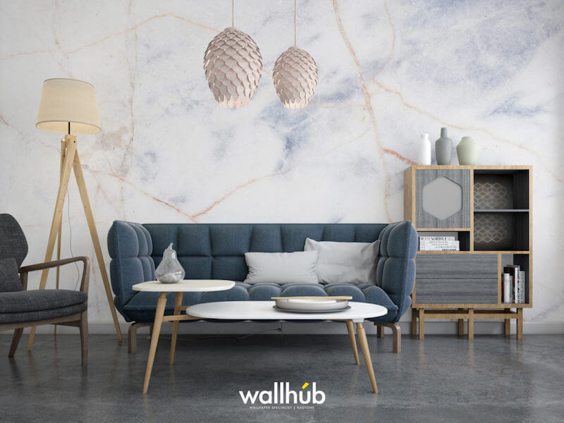
Bright equatorial light is unforgiving on plain surfaces. A flat white wall under strong midday sun bounces light back evenly and loses all definition, which is why so many freshly painted flats feel slightly clinical before the furniture arrives.
Texture solves this by introducing micro-shadow. A gently mottled or brushed surface holds variation across its face, so the wall still has depth at noon and warmth by lamplight. The colour stays white; the surface simply stops behaving like a blank sheet of paper.
The same principle explains why hotel lobbies and gallery spaces get away with almost entirely white schemes. There is nearly always a plaster, a stone or a fabric surface somewhere in the room supplying the depth that paint alone cannot.
Layering Warmth Into A Soft White Room
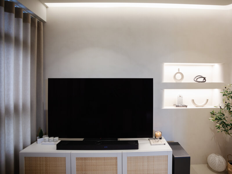
Cloud Dancer sits on the warmer, softer side of white, which gives you room to build around it without the palette turning cold. Natural materials do most of the work: oak or walnut joinery, a jute or wool rug, linen curtains, ceramic and stone accessories.
Contrast comes from finish as much as from colour. A matte wall against a satin skirting, or a textured feature wall beside smooth painted returns, creates separation the eye reads as detail even when everything is broadly the same shade. The comparisons set out in matte vs. eggshell vs. satin are a useful reference when deciding which surface takes which sheen.
Textiles carry more of a white scheme than most people expect. A heavy linen curtain, a slubby cushion cover and a rug with some pile give a room depth at eye level and below, which takes the pressure off the walls to be interesting on their own.
Greenery is the cheapest form of contrast available. A single large plant against a pale textured wall casts moving shadow through the day, and that does more for the character of a room than another cushion ever will.
Where A White Textured Wall Works Hardest
Some rooms benefit more than others:
- Living rooms with large windows, where texture stops the brightness flattening everything
- Bedrooms that need to feel restful without going dark
- Compact studies and nooks, where a pale surface keeps the space open but texture prevents it feeling bare
- Retail and cafe interiors, where a neutral backdrop lets stock or artwork carry the colour
Getting The Undertone Right
Whites are not interchangeable. Some lean pink, some lean green, and the difference only reveals itself once a large area has been covered. Sampling a decent-sized patch, at least a metre square, and looking at it both morning and evening will tell you far more than a paint chip held against a wall for ten seconds.
Pay attention to what the room already contains. Cool grey floor tiles drag a warm white towards beige by contrast, while warm timber flooring can make a cool white look faintly blue. Choosing a wall shade in isolation is the most common reason a white scheme ends up feeling slightly off without anyone being able to explain why.
Ceiling treatment is the quiet half of this. Carrying a slightly lighter or flatter white overhead keeps the walls looking intentional, and stops the room reading as one continuous, undifferentiated surface.
Keeping It Practical
Pale surfaces attract scrutiny, so durability and cleaning are fair questions to ask early. Textured finishes generally cope better with everyday marks than flat emulsion, since a varied surface disguises small scuffs, though deeper textures do take a little more effort to dust down.
High-traffic zones such as corridors and stairwells benefit from a harder-wearing specification, and skirting-height areas take most of the damage in any home with children or pets.
Think about where hands actually land. Light switches, door edges and the wall beside a sofa arm collect marks faster than anywhere else, and a slightly more robust specification in those spots keeps the rest of the scheme looking fresh for longer.
Touch-ups are easier to plan than to improvise. Keeping a small quantity of the same batch, along with a note of the application method used, means a future repair blends in instead of announcing itself as a patch.
Bringing The Look Home
A soft white scheme rewards restraint and good materials more than a big budget. Choose a surface with some life in it, keep the undertones consistent across the room, and let timber and textiles supply the warmth.
Metallics need a light hand as well. A subtle pearlescent or a soft champagne detail lifts a pale scheme, while a strong metallic finish across an entire wall pulls the room somewhere considerably more formal than a soft white was ever going to suggest.
If you would like to see how different finishes behave in a soft white, Wallhub’s gallery has samples applied across a range of techniques so you can compare them side by side. Drop in or get in touch with our team, and we will help you land on something that feels calm instead of empty.