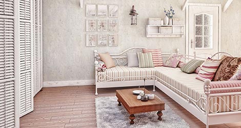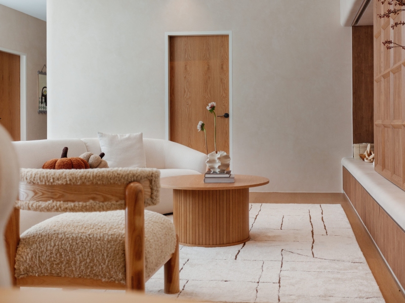
Singapore homes have been quietly falling in love with Japanese design for a while now, and it is not hard to see why. There is something about the calm, uncluttered feel of a space inspired by wabi-sabi and washi textures that just makes a home feel like a proper retreat, especially after a long day out in the heat and hustle. If you have been scrolling through interior mood boards lately, chances are you have already come across the soft, textured look of Japanese wallpaper without quite knowing what to call it.
This guide walks through what makes Japanese wallpaper such a lovely choice for local homes, from the philosophy behind wabi-sabi to the practical side of choosing patterns and textures that suit your space. Whether you are renovating a new place or simply refreshing a tired wall, there is a good chance one of these styles will speak to you.
What Wabi-Sabi Actually Means for Your Walls
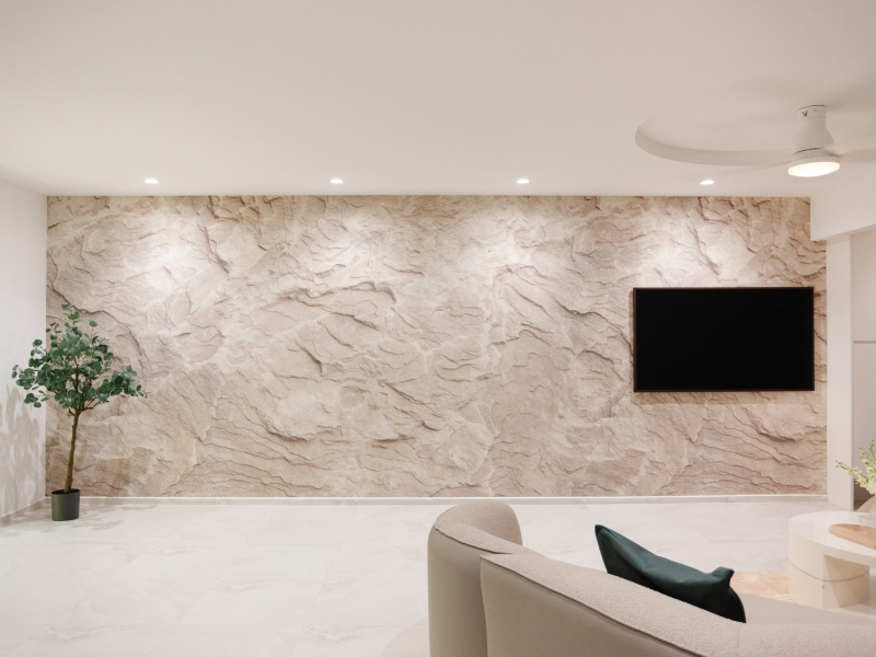
Wabi-sabi is a Japanese aesthetic that celebrates imperfection, simplicity and the beauty of things that are natural rather than polished. Think uneven textures, muted tones and a general sense of calm instead of anything loud or glossy. When this philosophy gets translated into wallpaper, you get finishes that mimic aged plaster, raw linen or hand-pressed paper rather than sharp, high-shine surfaces.
For homeowners tired of the typical showroom look, wabi-sabi wallpaper offers something refreshingly honest. It does not try to hide flaws. Instead, it leans into subtle irregularities, giving each wall a bit of character and warmth. This is also one of the best wallpaper options for HDB flats for people wanting a cosy, grounded feel without going overboard on colour or pattern.
The Charm of Washi Textures
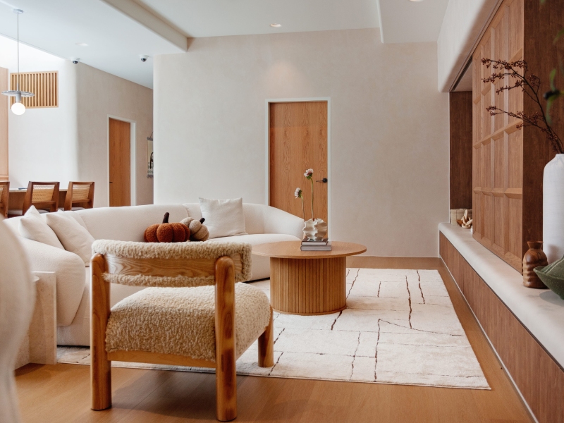
Washi is traditional Japanese paper, often handmade using fibres from mulberry bark or other plants. It has a distinct, slightly fibrous texture that catches light in a soft, diffused way rather than reflecting it sharply. Washi-inspired wallpaper brings that same gentle texture into a modern home, giving walls a tactile quality that flat paint simply cannot match.
What makes washi textures particularly appealing is how forgiving they are. Small imperfections in the wall underneath tend to blend into the paper’s natural grain rather than standing out. This makes it a practical option for older homes or resale flats where walls are not always perfectly smooth.
A few reasons people gravitate towards washi textured wallpaper:
- The soft, matte finish reduces glare, which is handy in bright, sunlit rooms
- It pairs beautifully with wood, rattan and other natural materials
- The subtle texture adds depth without overwhelming a small space
- It tends to feel warmer underfoot in terms of visual temperature, if that makes sense, compared to cold, glossy surfaces
Minimalist Patterns That Do a Lot with a Little
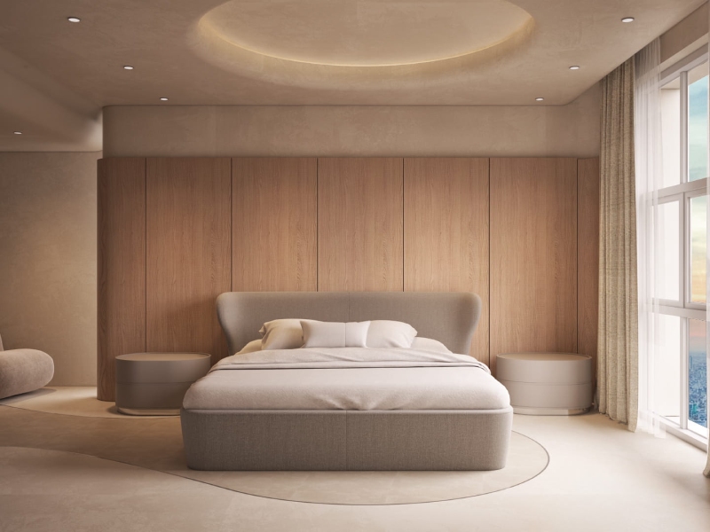
Japanese design is often associated with minimalism, and wallpaper is no exception. Instead of busy florals or bold geometric prints, you will find patterns inspired by nature such as bamboo stalks, gentle waves, cherry blossoms rendered in a single tone, or subtle grid lines reminiscent of shoji screens. These patterns are quiet by design. They add interest to a wall without competing with furniture, artwork or the rest of the room.
This restraint is part of the appeal for smaller homes. A loud pattern can make a compact room feel busier and more closed in, whereas a soft, minimal print tends to open things up visually. If you are working with limited square footage, this is often the gentler route.
Here is a quick comparison of common Japanese-inspired wallpaper styles and where they tend to work best:
| Style | Best Suited For | Overall Feel |
| Wabi-sabi textured | Living rooms, bedrooms | Calm, rustic, grounded |
| Washi paper effect | Study areas, hallways | Soft, tactile, warm |
| Bamboo or nature motif | Dining areas, feature walls | Fresh, understated |
| Shoji grid pattern | Home offices, walk-in wardrobes | Structured, serene |
Choosing the Right Colour Palette
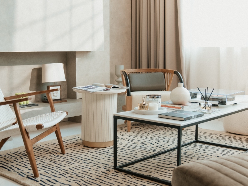
Japanese wallpaper tends to favour a restrained palette. Think off-whites, soft greys, muted greens, warm beiges and gentle browns. These tones are inspired by natural materials such as clay, wood and stone, and they age gracefully rather than looking dated after a few years. If you are drawn to this style but unsure where to begin, starting with a neutral base and adding texture is usually a safer bet than committing to a bold colour straight away.
For those who still want a touch of colour, a soft sage or dusty blue can work beautifully as an accent, particularly on a single feature wall. This keeps the overall look calm while still giving the room a bit of personality.
Practical Tips Before You Commit
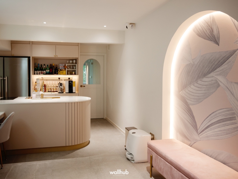
Before choosing a wallpaper, it helps to consider a few things. Lighting plays a big role, since textured papers can look quite different under warm versus cool lighting. Room size also affects how a pattern reads, with larger prints sometimes overwhelming smaller spaces. Lastly, think about durability, particularly in areas like hallways or near kitchens where walls see a bit more wear and tear.
It also helps to get a physical sample before committing to a full roll. Photos and screens rarely capture the true texture and tone of washi or wabi-sabi finishes, and colours can shift depending on how much natural light your home gets throughout the day.
Bringing It All Together
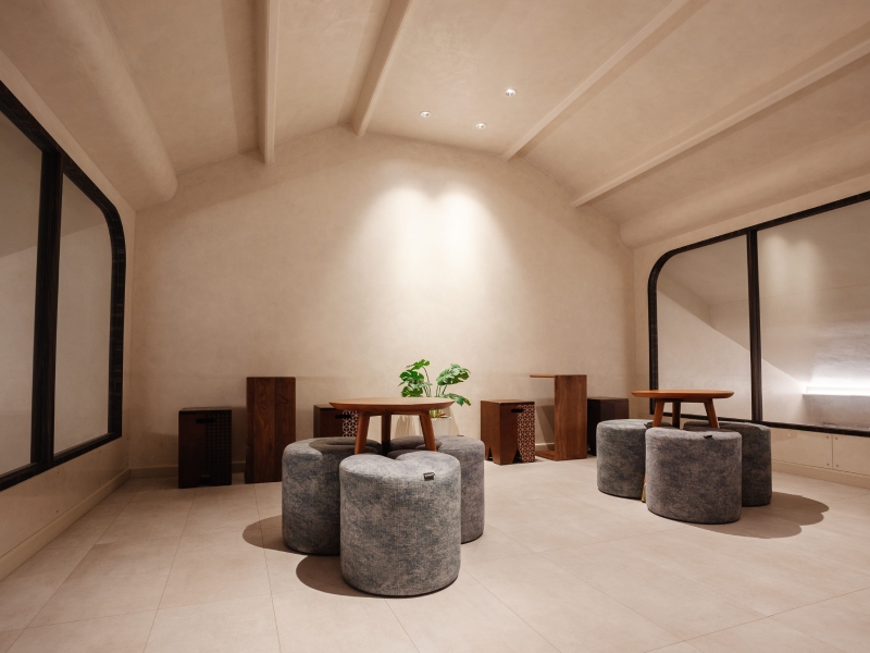
Japanese-inspired wallpaper offers a lovely middle ground between minimalism and warmth. It is not about stripping a room bare, but about choosing textures and patterns that feel calm, considered and a little more personal than the standard options on the shelf. Whether you lean towards the raw charm of wabi-sabi or the softness of washi paper, there is likely a style that fits the mood you are going for.
If you would like to see these textures and patterns in person before making a decision, Wallhub has a lovely range worth browsing.