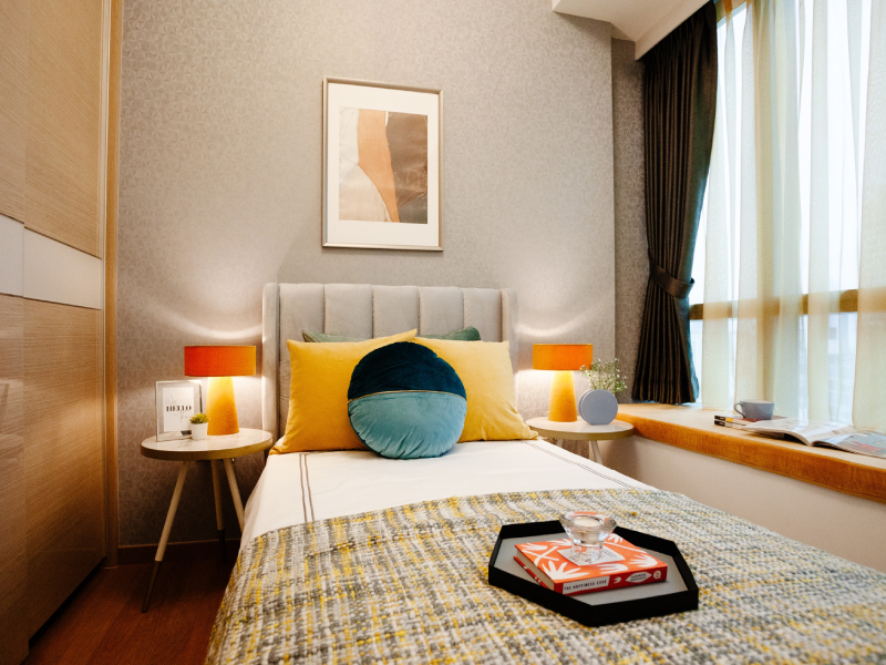
Walls are the largest surfaces in a room, and their finishing affects every other detail of your grand decorating plan. It is essential to decide what colour or pattern you are going for if you want a unifying element for your home. With wallpaper, the variety of results you can create is virtually limitless.
Nothing gives a room more aesthetic appeal effortlessly than wallpaper. It gives your home a burst of vibrance, with virtually any design style and colour palette you can imagine. Wallpapering opens up the magic of pattern and the power of texture; with the right palette, you can add just the right touch of drama, impact, and style to your living space.
It is important to note that there is no such thing as a “wrong” colour. But if you want a practical design that appeals not just to yourself, it is vital to consider how the different colours in the room will interact with each other. Besides defining your style, you can also control the space, set the mood, accent the room’s advantages and hide its faults.
Desired effect
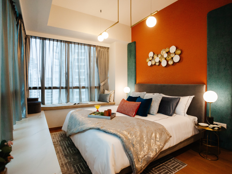
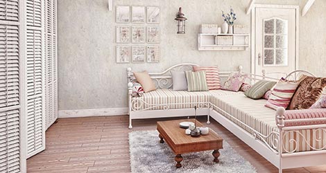
It is a known fact that colours influences our mood and manipulates our perception of a room. For example, light colours, small patterns, and subtle textures are used to make a room appear more spacious and light. Dark and intense colours make a room seem rich and intimate. Strong vertical patterns are frequently used to visually raise a low ceiling – Korean wallpapers are the go-to to achieve this illusion.
Colour variations
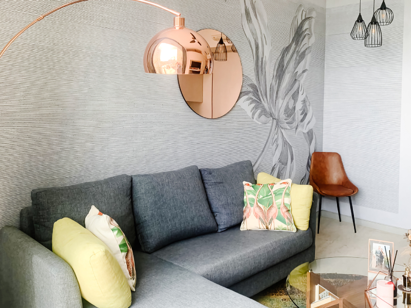
Mixing colours with a pinch of white or black in differing proportions produces thousands of options. That said, you need to keep three elements in mind when choosing or creating from scratch the design of your wallpaper: hue, intensity, and value. Hue is the pure expression of colour. Intensity is synonymous with saturation— the more saturated the colour, the more vivid it is to the eye. Value refers to the relative lightness or darkness of a colour. Because the wallpaper will be the room’s main feature, its colour affects significantly how everything else in the room would blend in seamlessly.
Colour and light
Decorating schemes will look very different depending on the source of light, e.g. natural light or sunlight vis-à-vis artificial light such as incandescent or fluorescent light. Artificial light is especially tricky because it comes in colours with varying ambience and colourcast. You will also need to mind task lighting, an example of which is under-cabinet lighting and accent lighting, an example of which are lamps.
Conclusion
There are a lot of handy tools available to aid in your decision, such as a colour value scale or the quintessential colour wheel, which shows you how colours relate to each other. You can also ask your retailer for a colour fan deck, which indicates exact colour combinations.
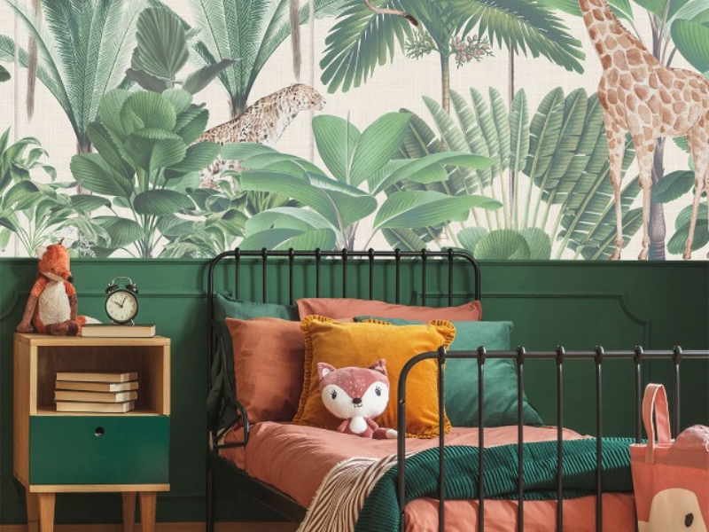
Experimenting with what works best in your space is the way, and you can do this by sampling wallpapers instead of making an ultimate decision for the entire wall space. You could also start with the more private rooms, such as the kids’ playroom, as it allows you to play around with quirky colour combinations and creative kids wallpaper in Singapore. Starting small and then going big not only helps you to create the mood board and visual for the rest of your living space, but you would also have a lot of fun seeing your vision come to life.